GRAPHING DATA © 2019
Graphing Data is part of the research framework carried out for the project [MAFD] :: Mapping Active Fire Data, exhibited in Tabacalera, Sala La Fragua; and whose main objective is to show the wounds suffered by the earth's crust due to the enormous amount of active forest fires that, intentionally or accidentally, are produced on it.
Graphing Data is part of the research framework carried out for the project [MAFD] :: Mapping Active Fire Data, exhibited in Tabacalera, Sala La Fragua; and whose main objective is to show the wounds suffered by the earth's crust due to the enormous amount of active forest fires that, intentionally or accidentally, are produced on it. The proposal, [MAFD], is based on a dynamic and interactive cartographic visualisation of locations and data of actively burning forest fires around the world, in the time frame of the last decade.
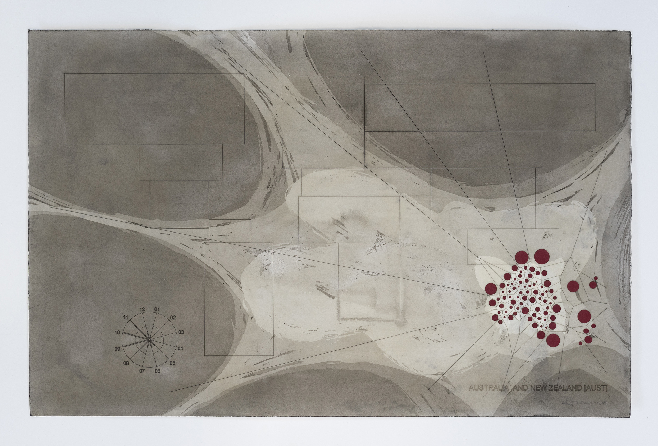
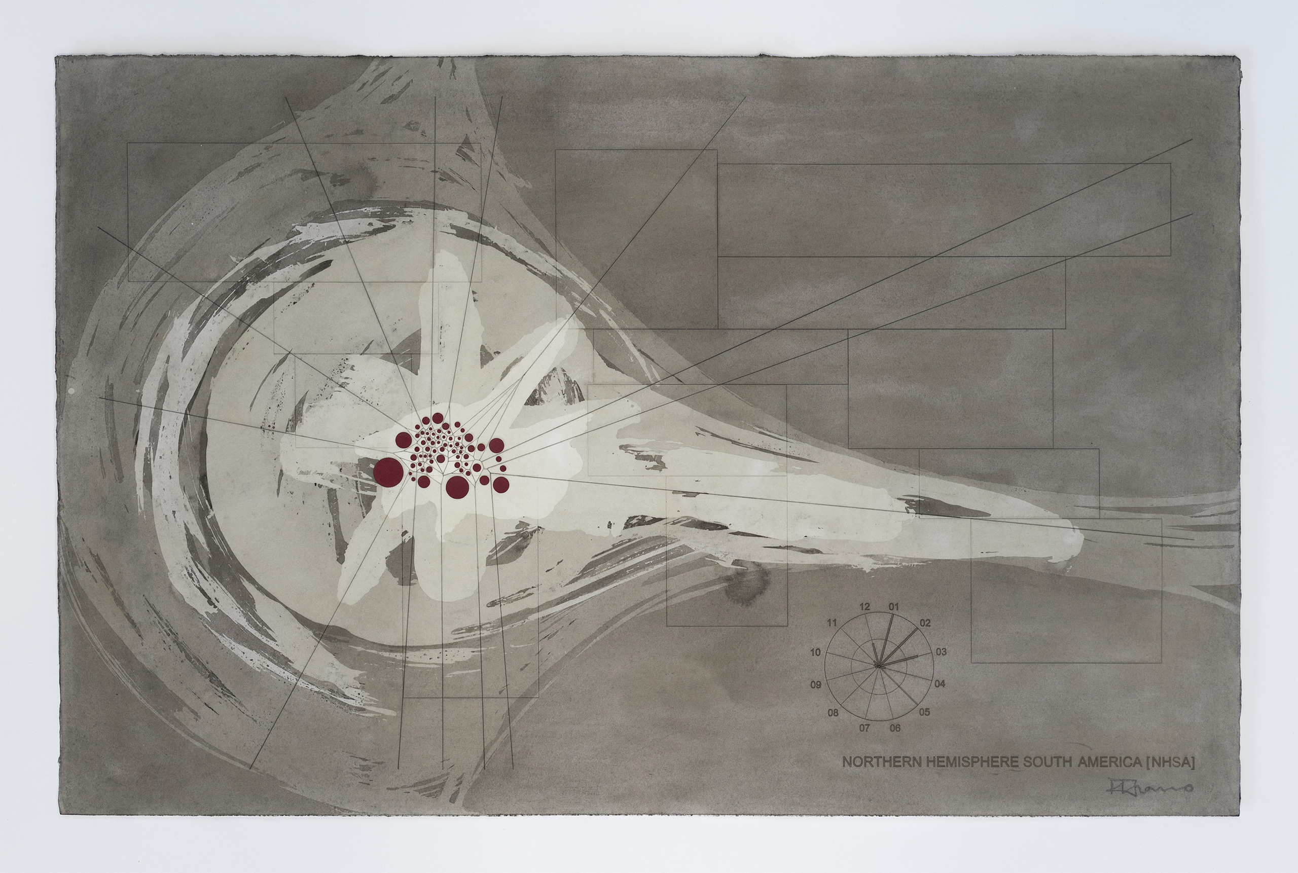
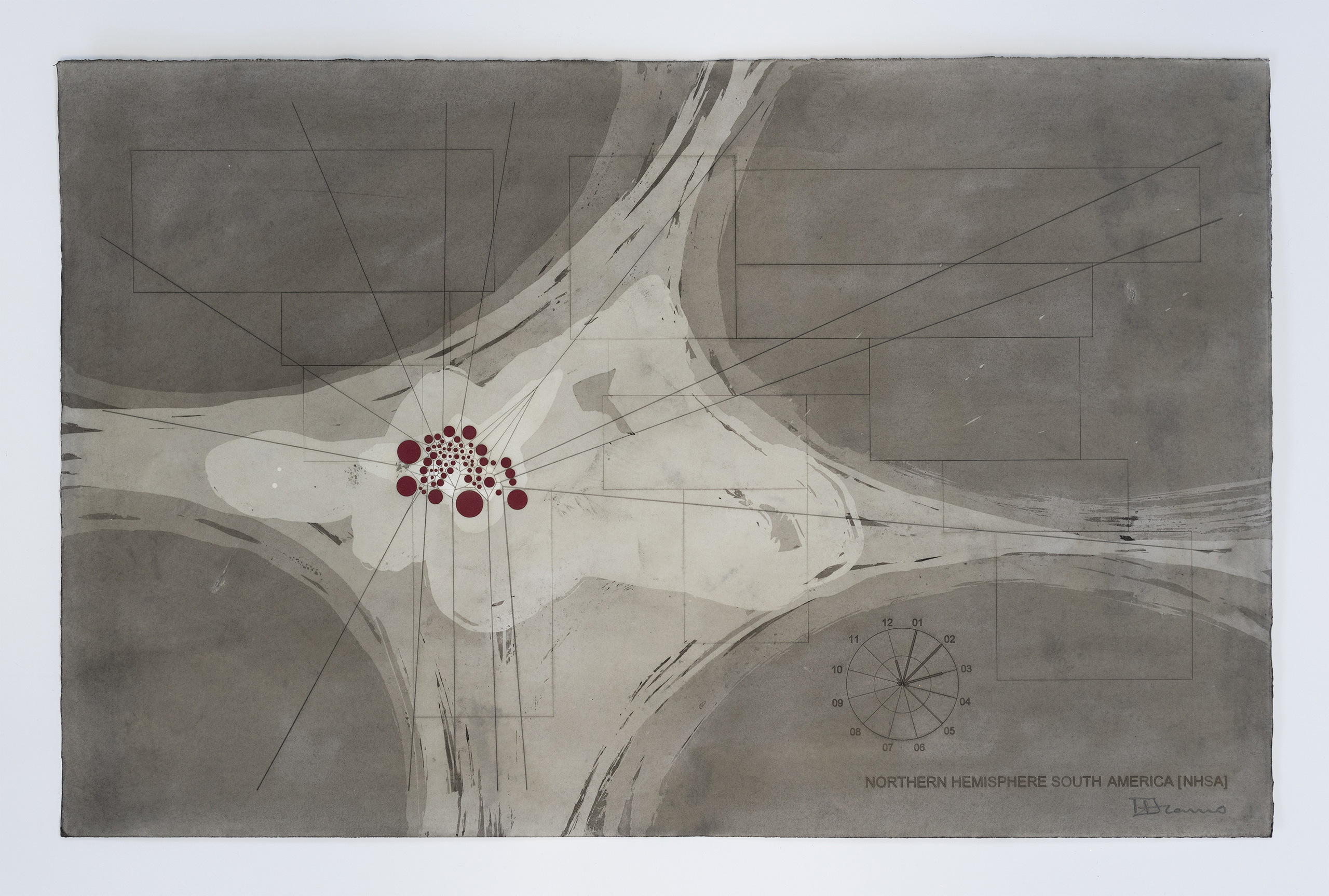
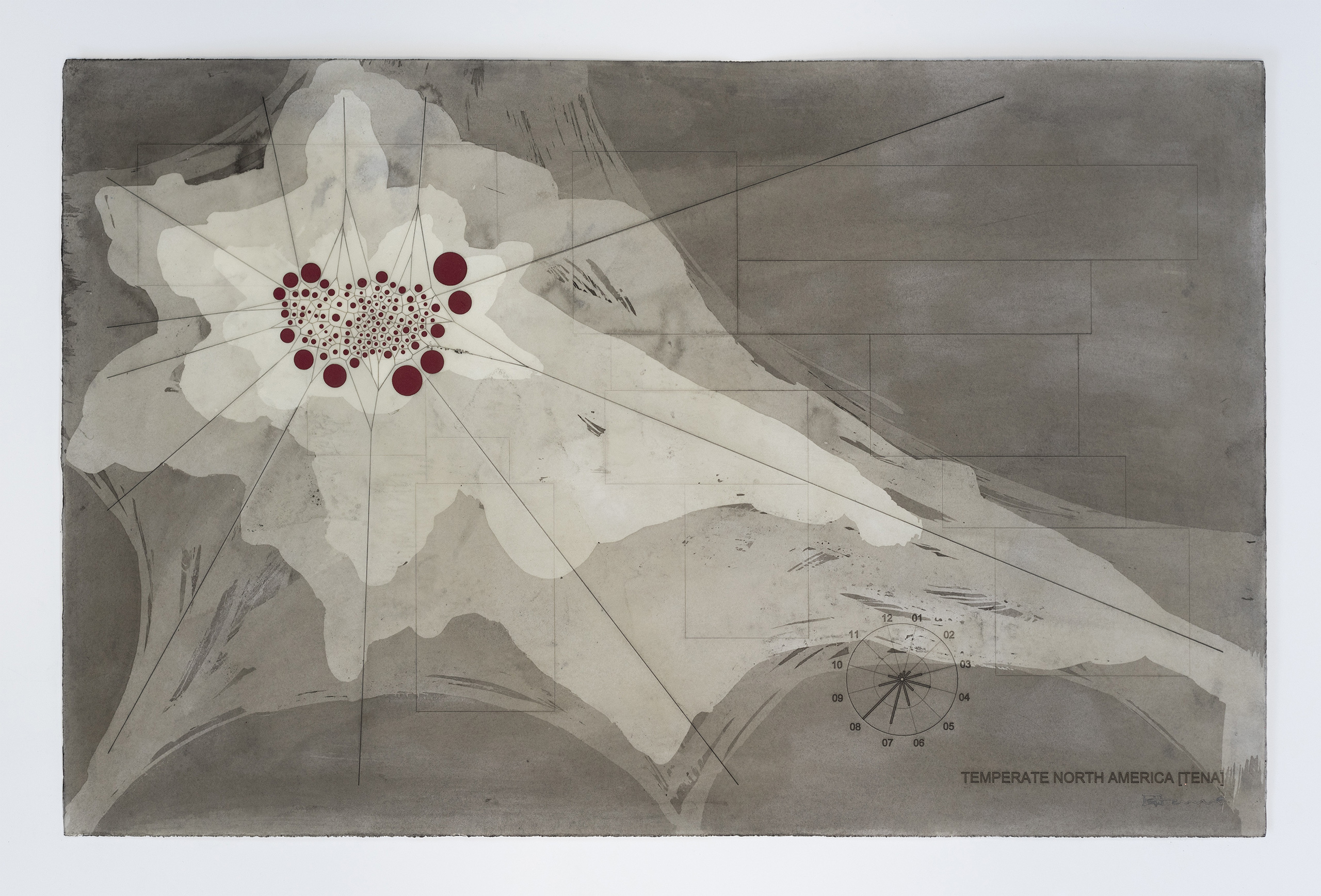
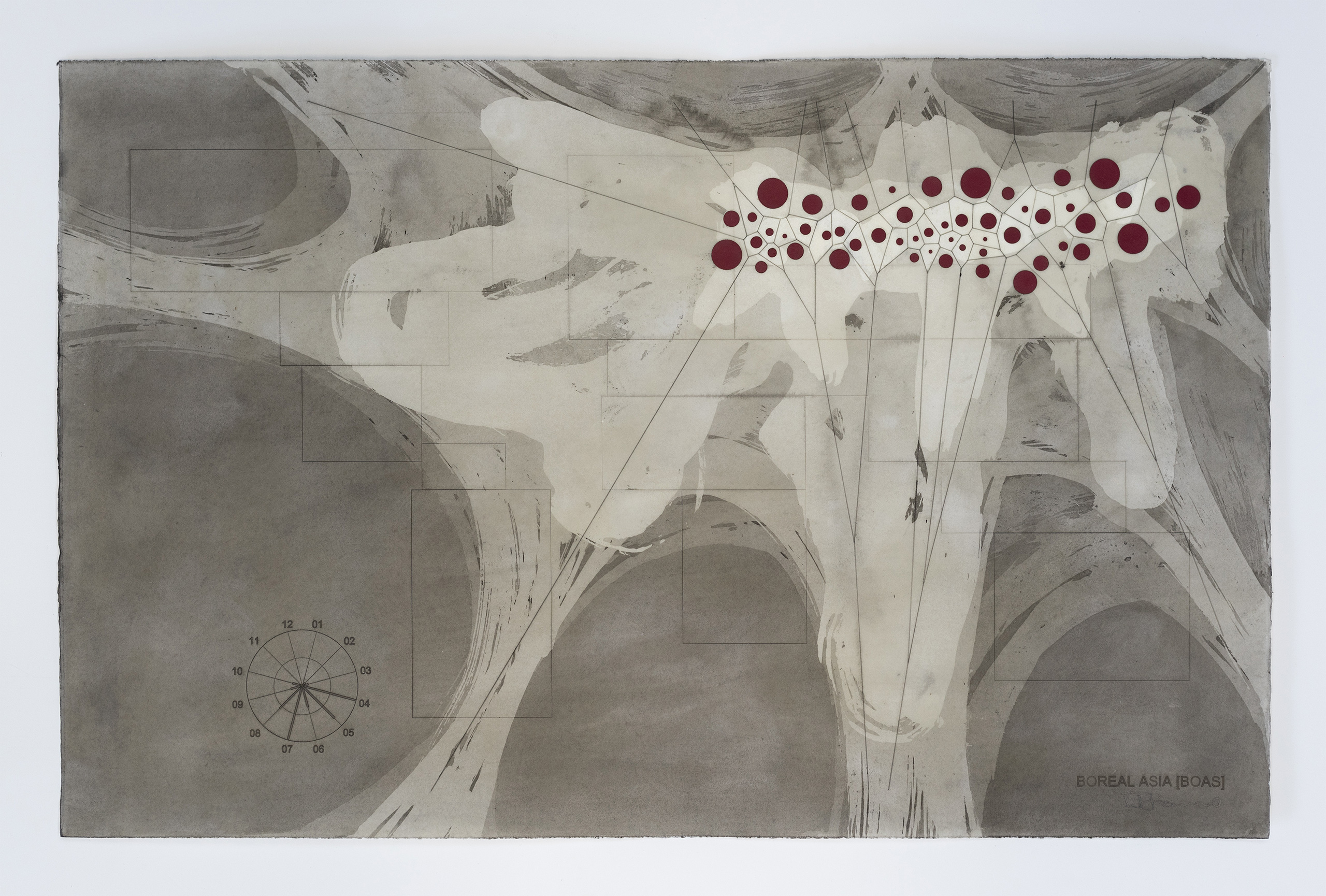
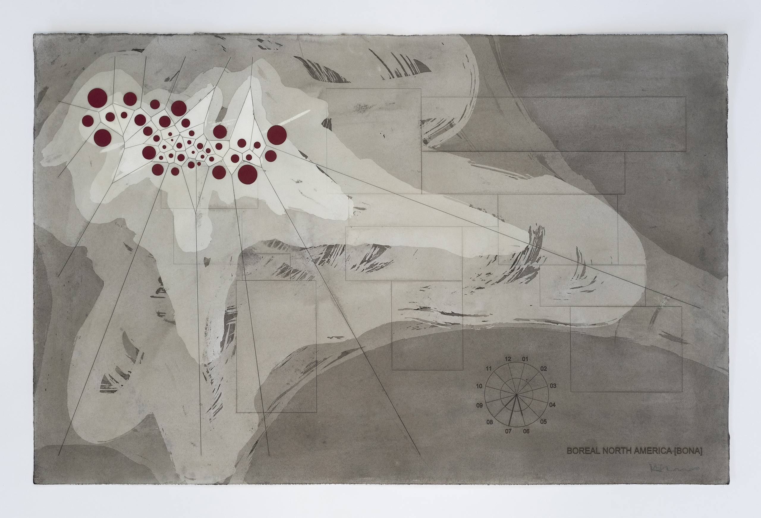
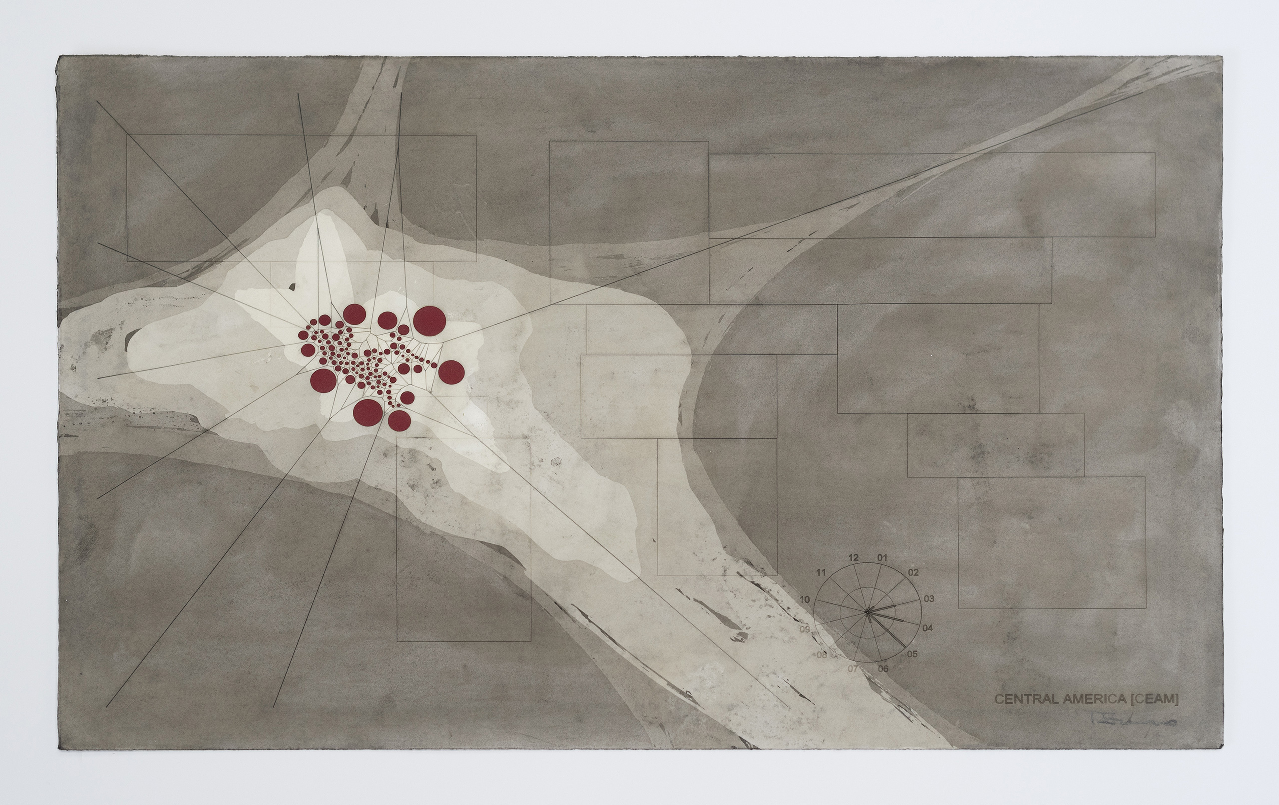
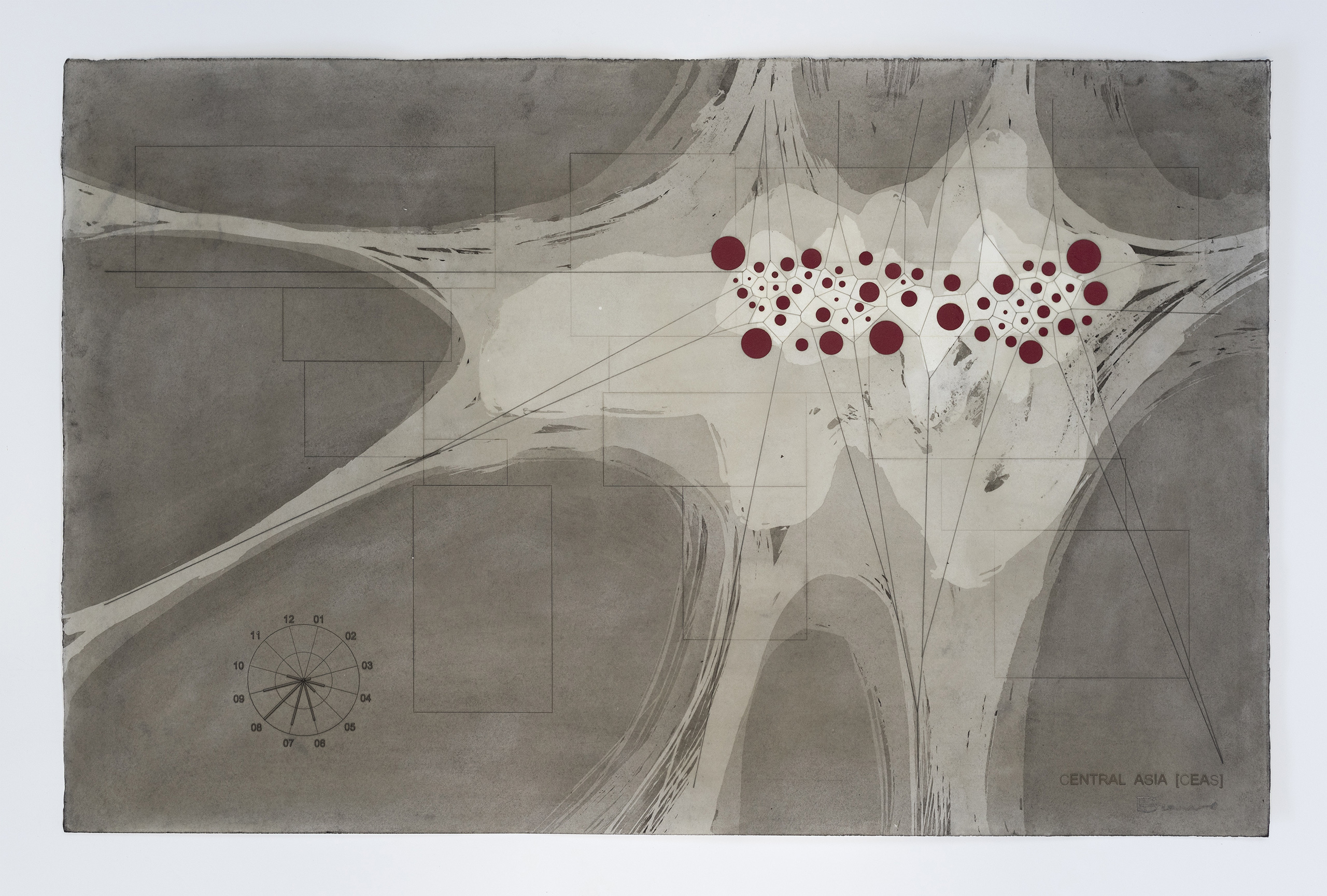
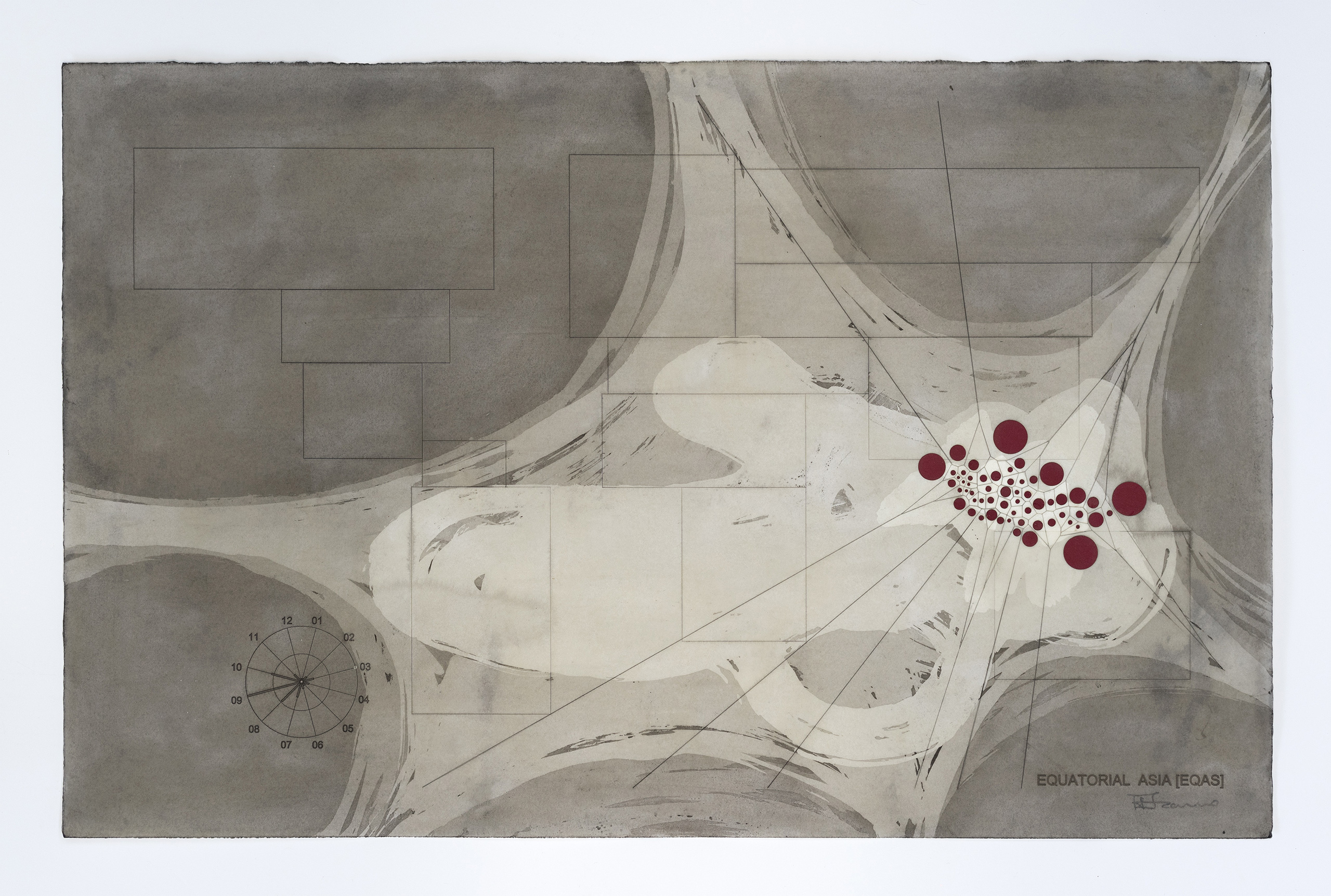
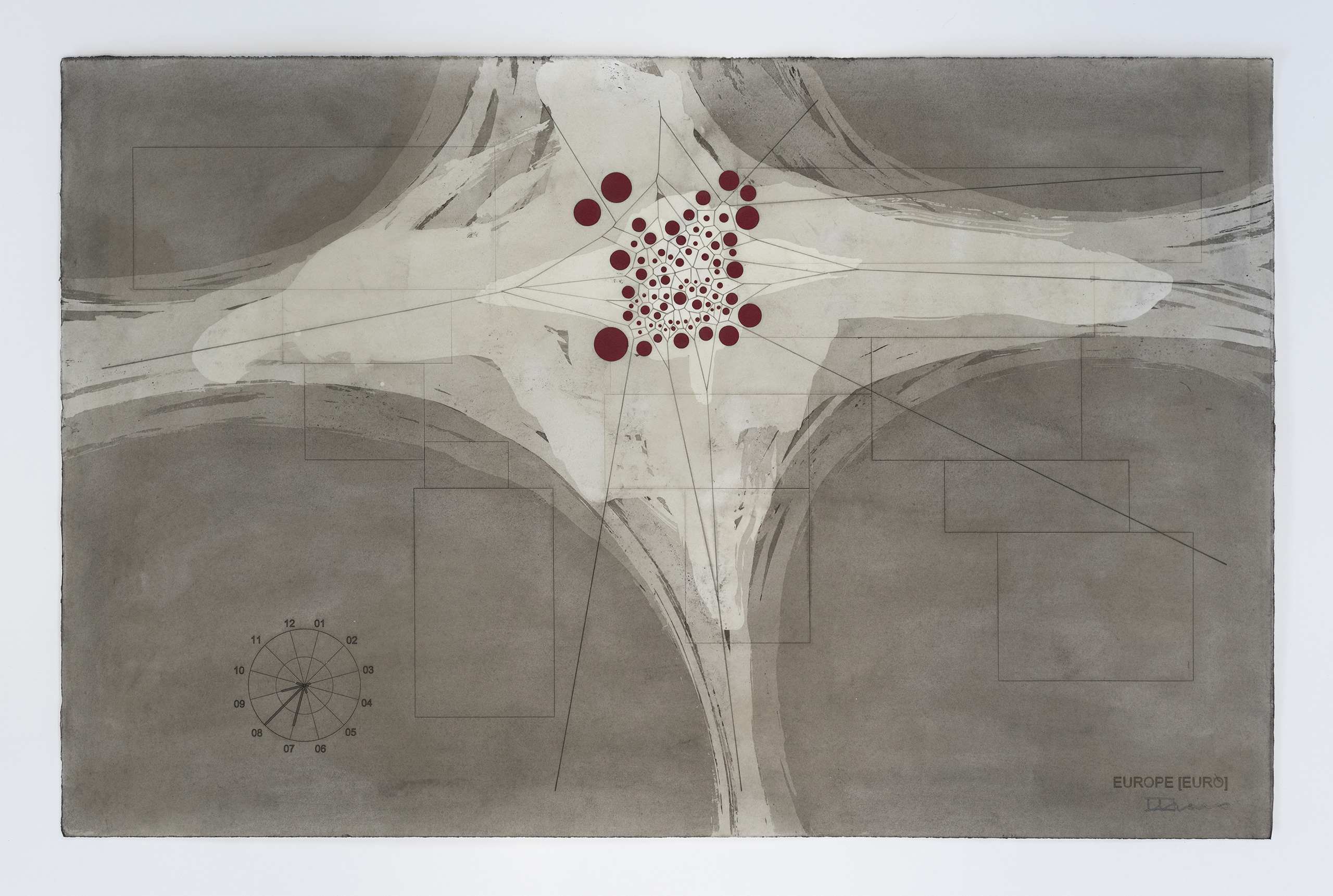
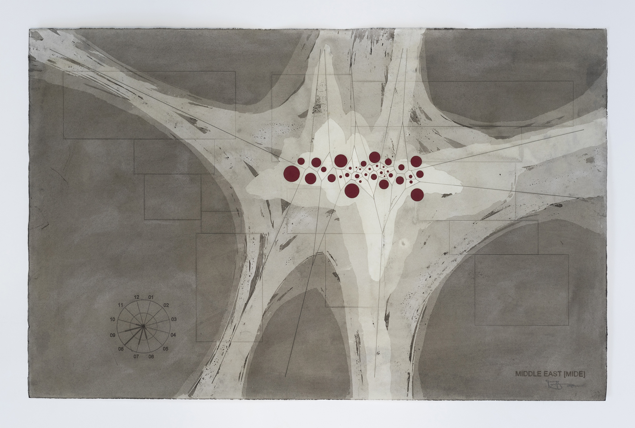
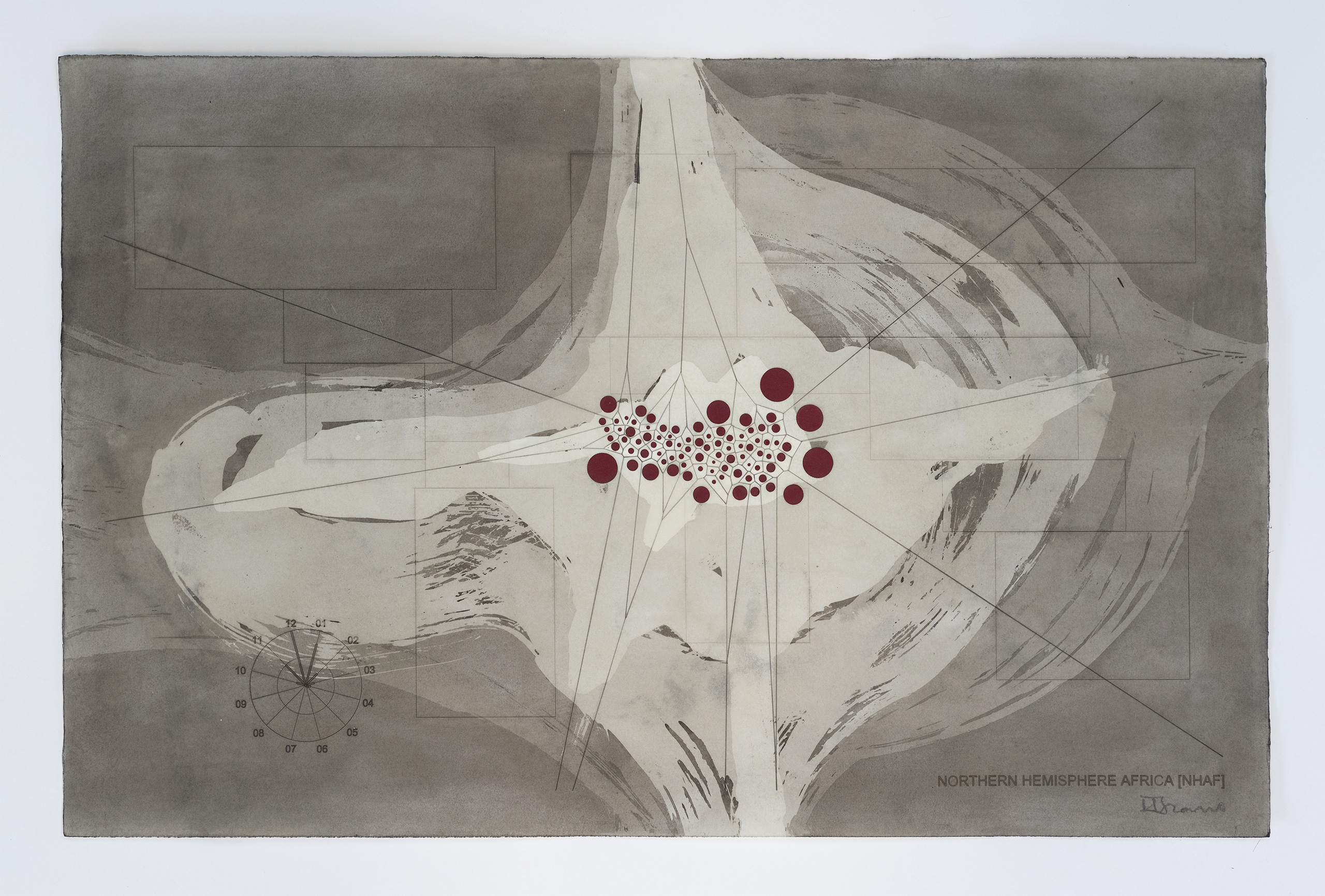
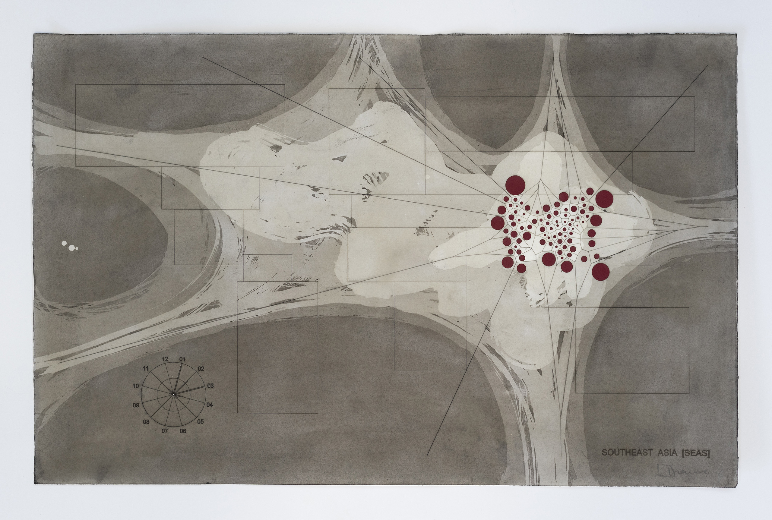
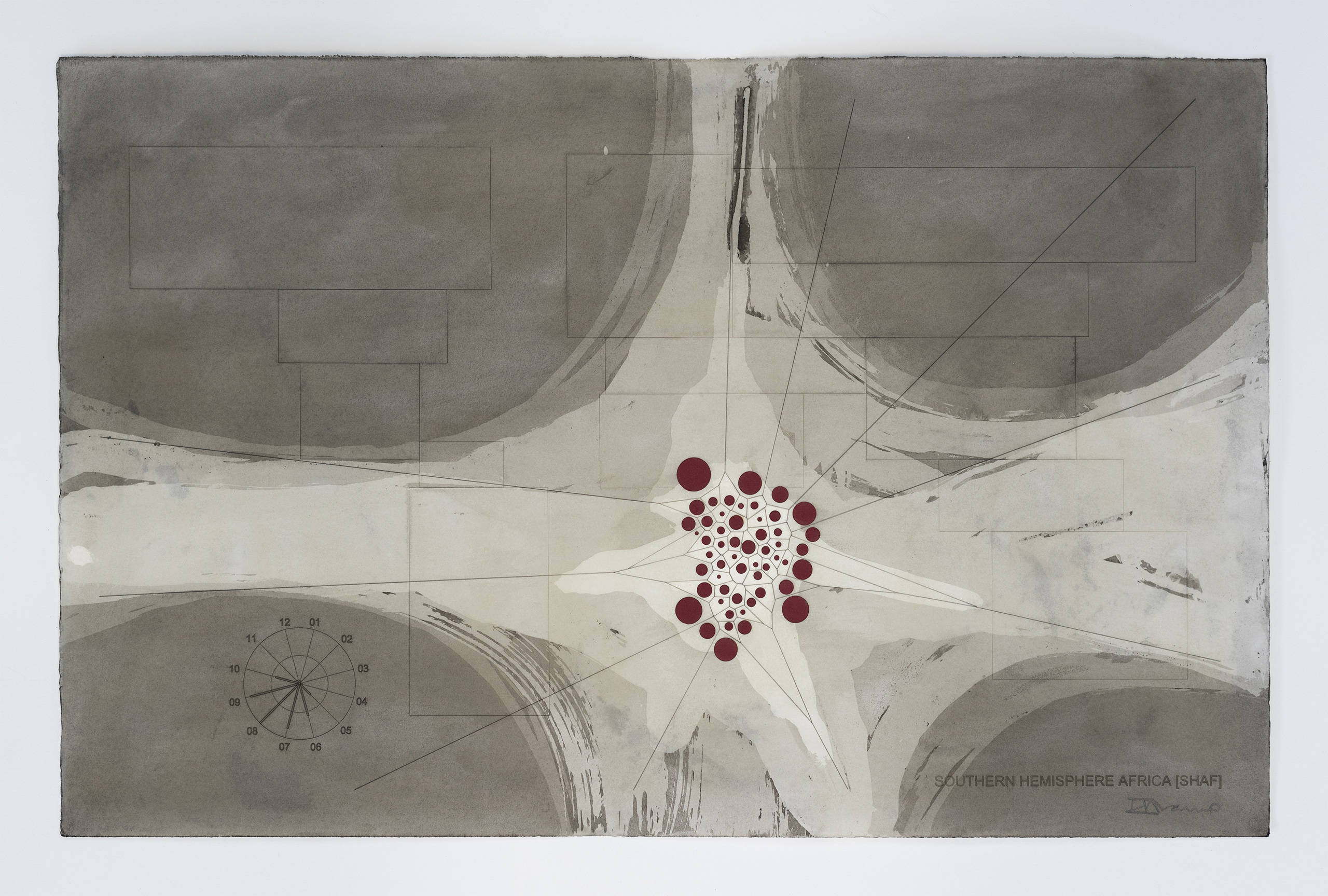
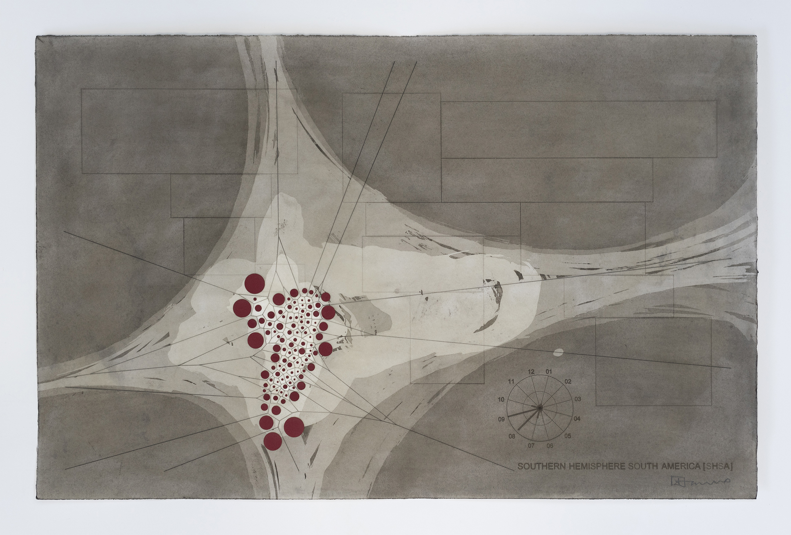
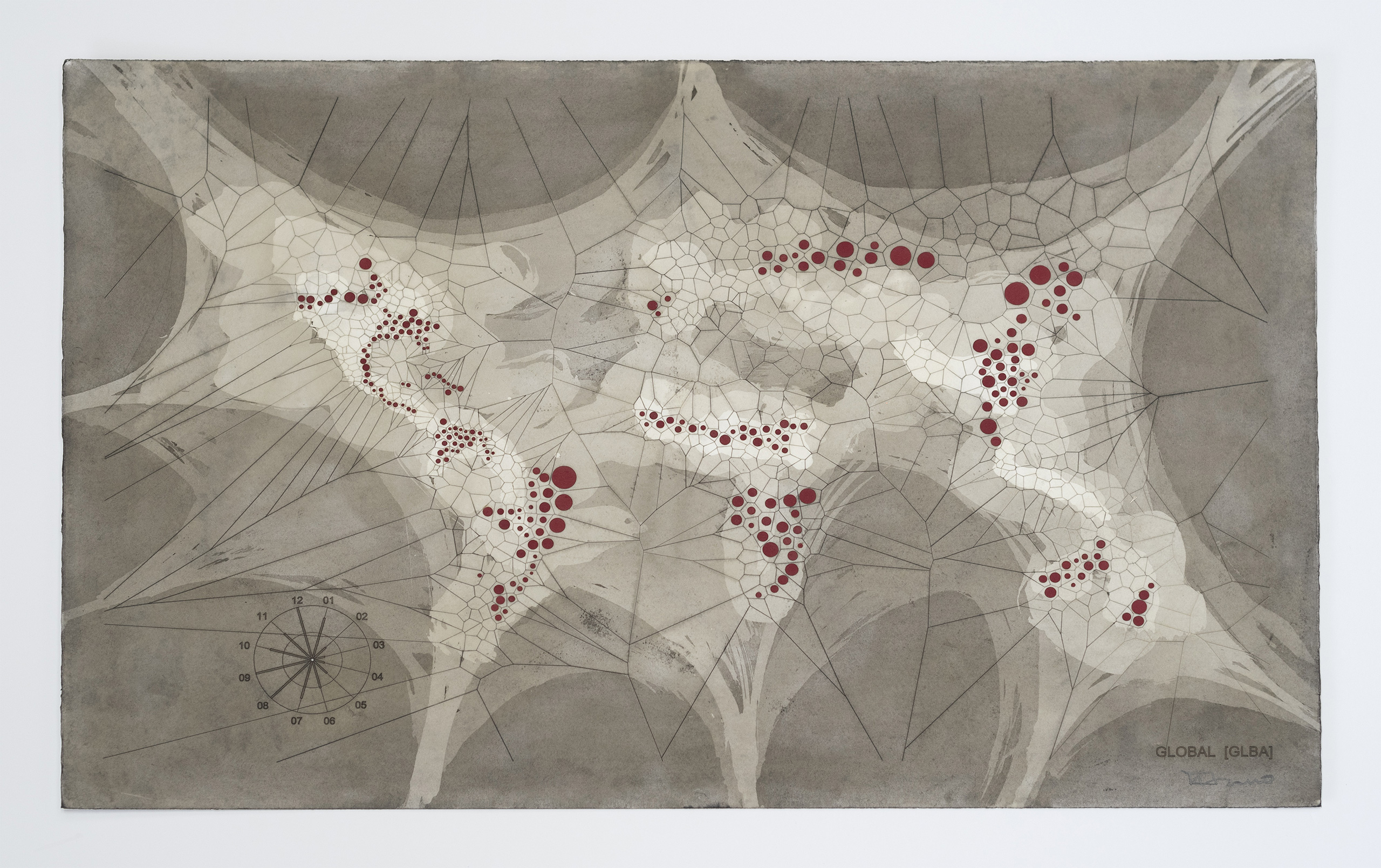
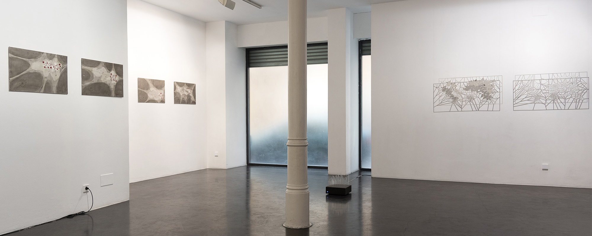
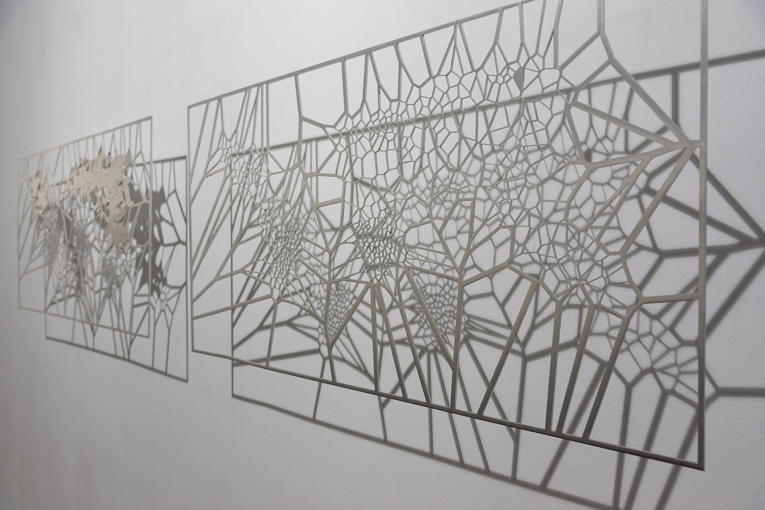
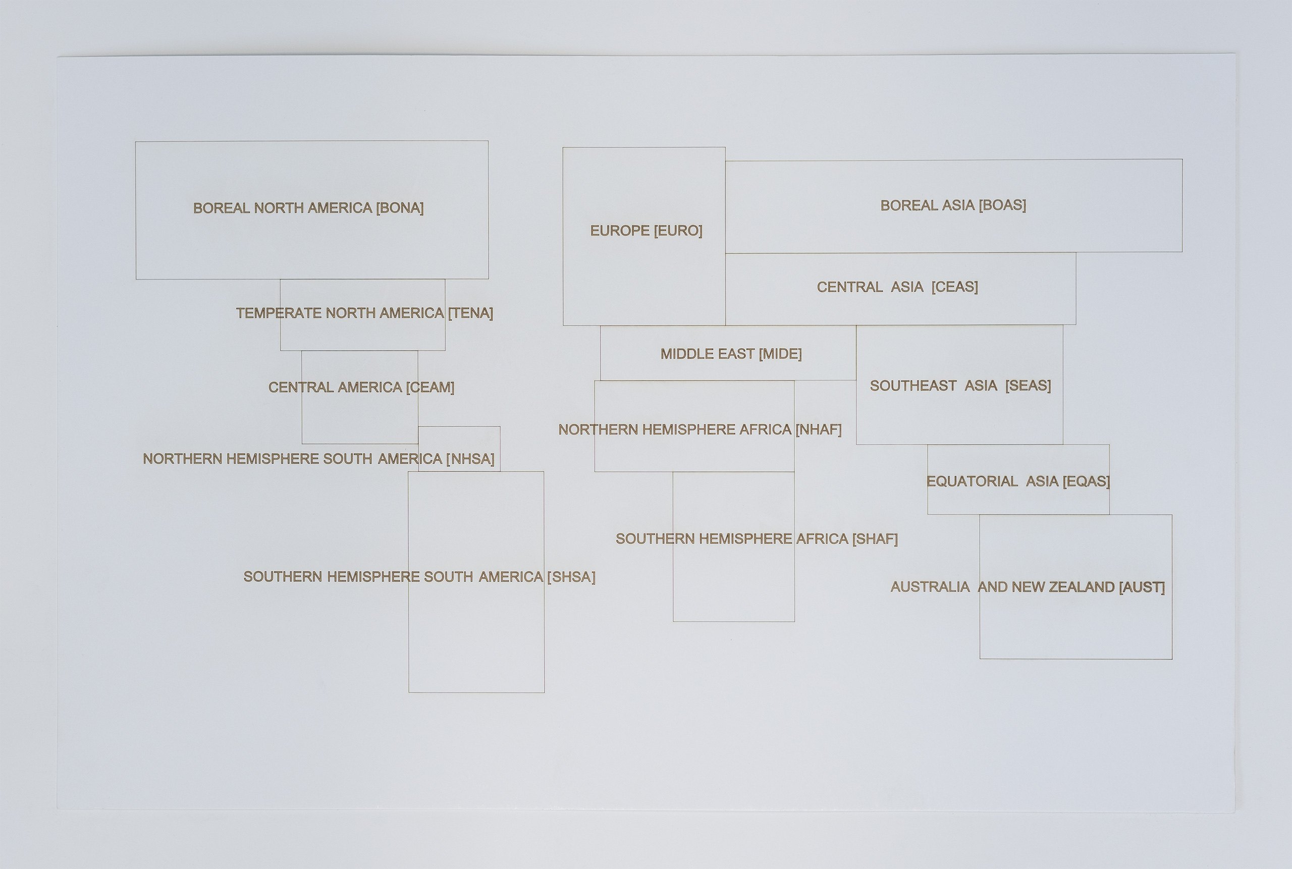
As a continuation of this line of work, Ponce+Robles presents the series [MAFD] :: Drawings, a set of fourteen drawings, each one of them showing a geographical area of the terrestrial planisphere, according to the spatial division of the Global Fire Emissions Database (GFED). These are diagrammatic cartographies, based on the principle of the Voronoi Diagram, a type of generative computational geometry based on the concept of Euclidean metric distance. The different geometric patterns are generated from the identification in the images extracted from the Moderate Resolution Imaging Spectroradiometer (MODIS) of the centroids, the origin of fire outbreaks. The resulting geometric lattice in each mapping gives us an idea of the areas affected by large fires and the clustering or dispersion of CO2 emissions. The higher the concentration of fires and gases (centroids), the tighter the cell; and the greater the dispersion of fire outbreaks, the larger the size of the resulting area. A cartography based on the visualisation logic of the "point density map" where each red circle represents the focus of an area devastated by fire.
The exhibition is completed with small and medium-sized sculptures made of borosilicate rod with light programming. Based on data from forest fires, but this time decontextualised from their geographical space, they formulate dynamic gazes based on the refraction of light from abstract graphs and diagrams. A methodological exercise of the infinite possibilities offered by the visualisation of data-based information.
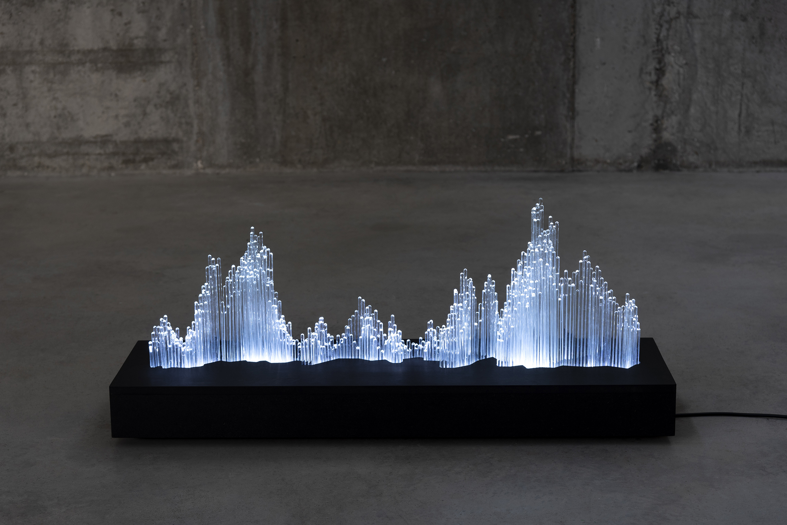
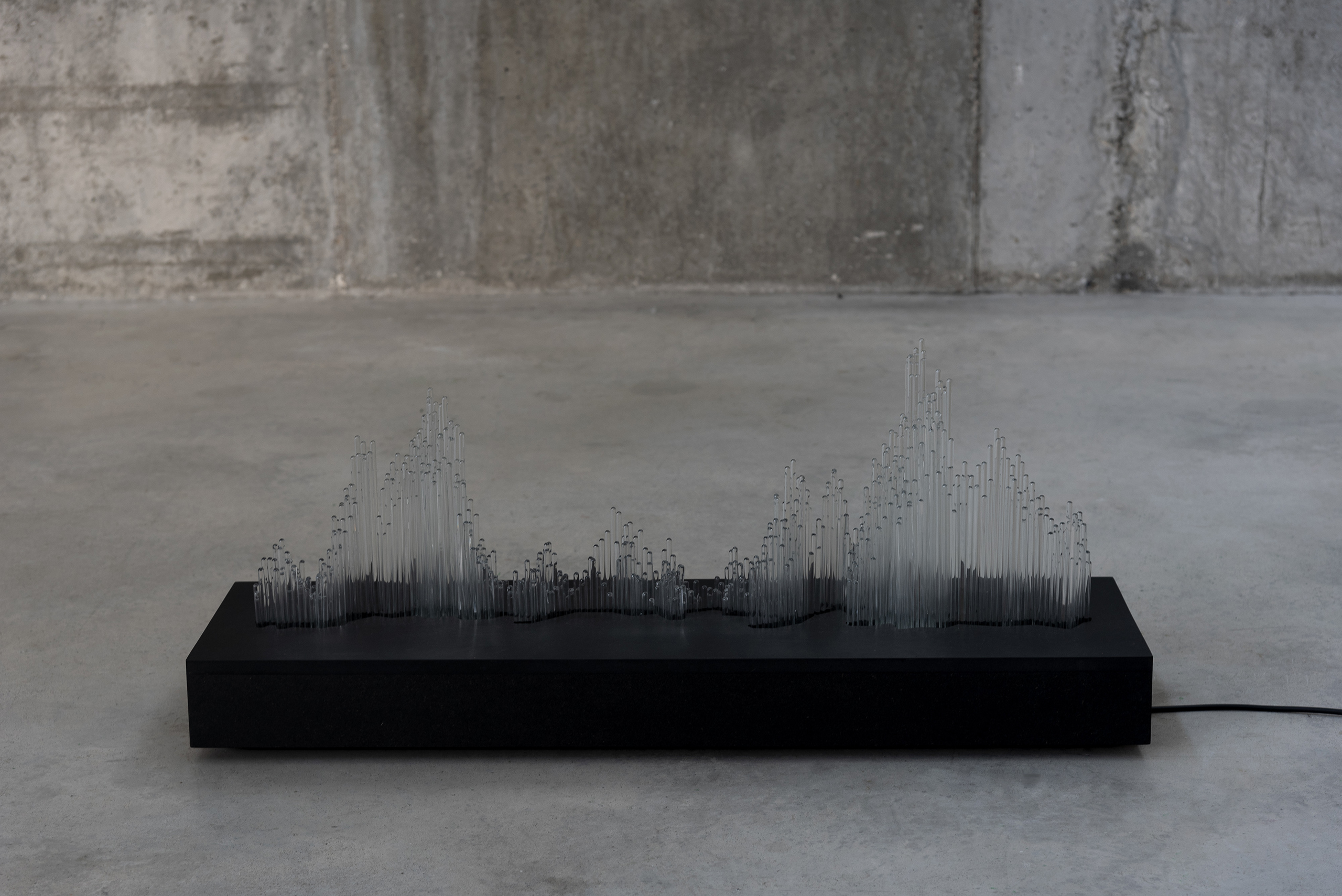
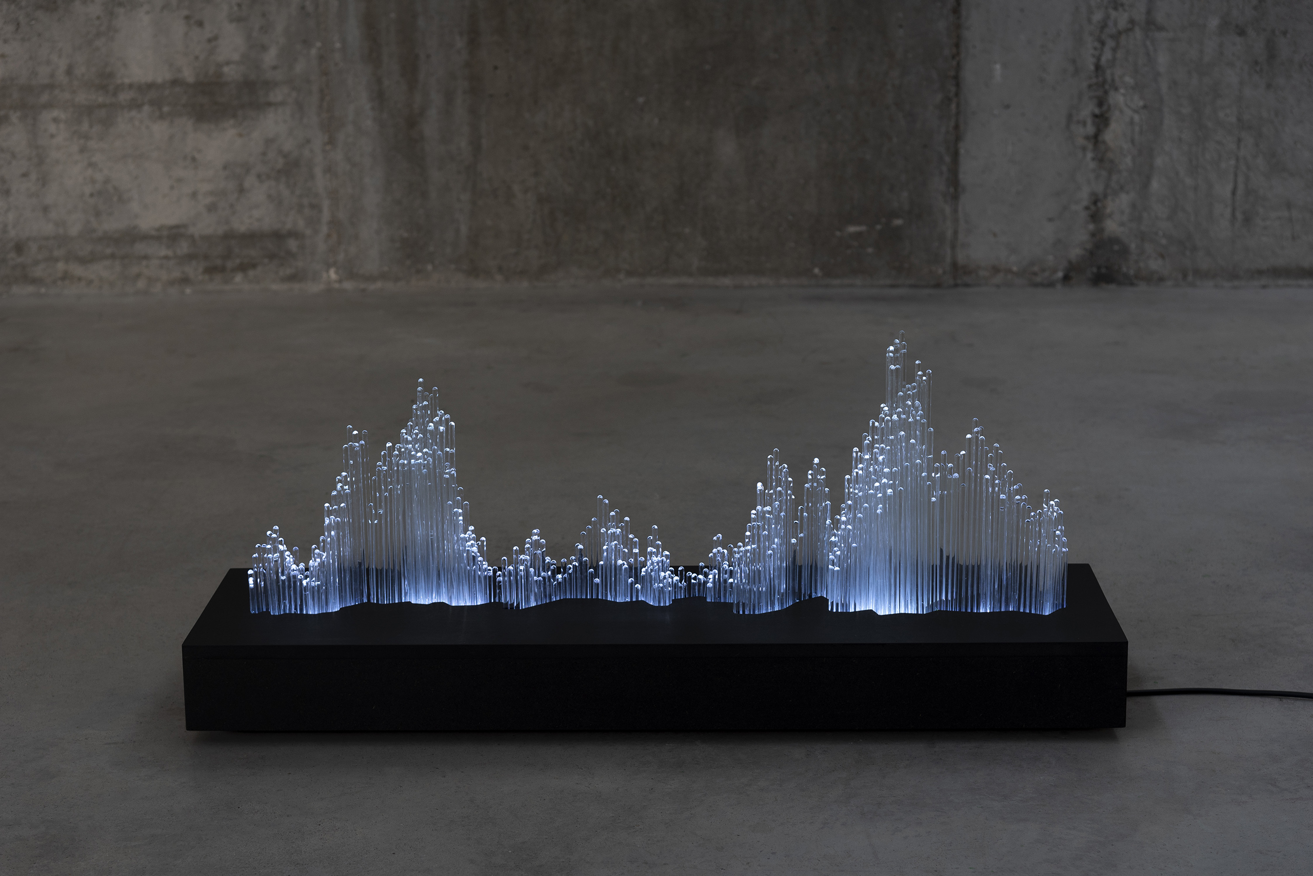
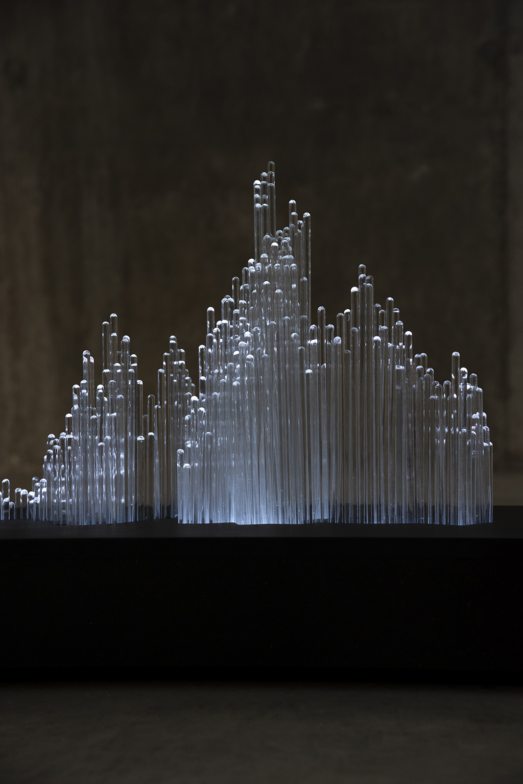
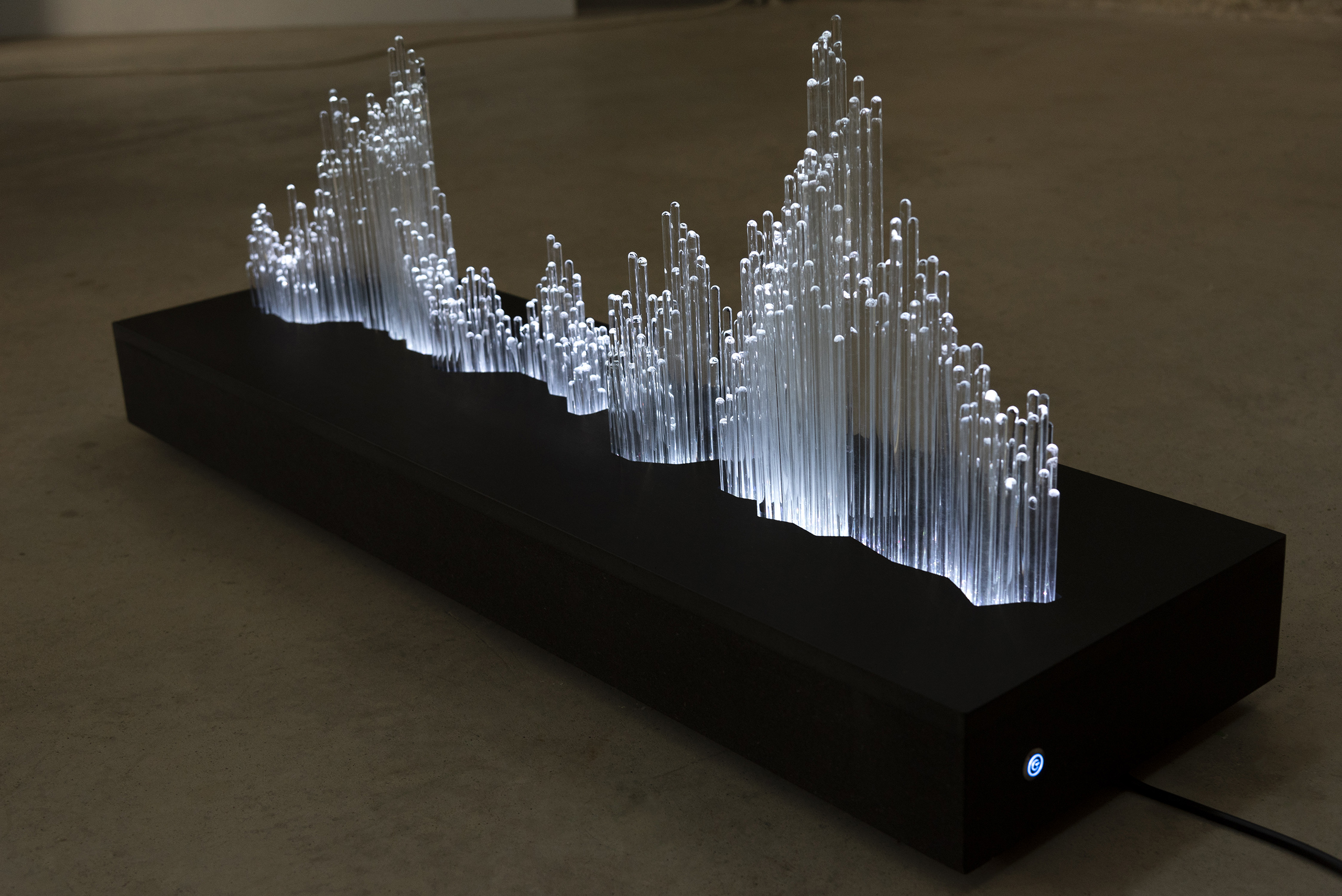
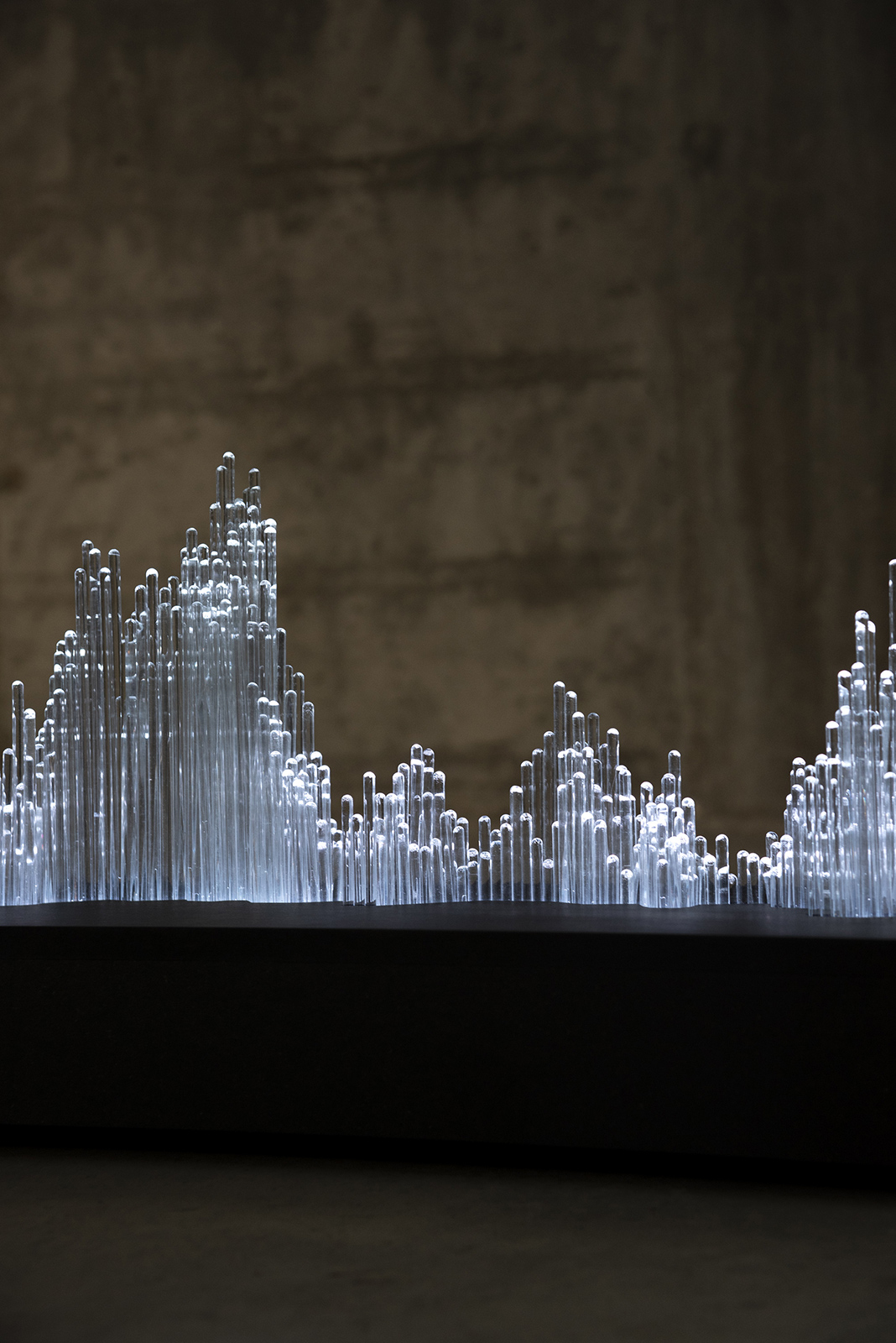
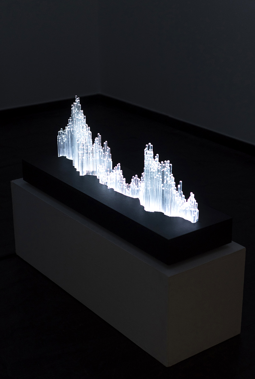
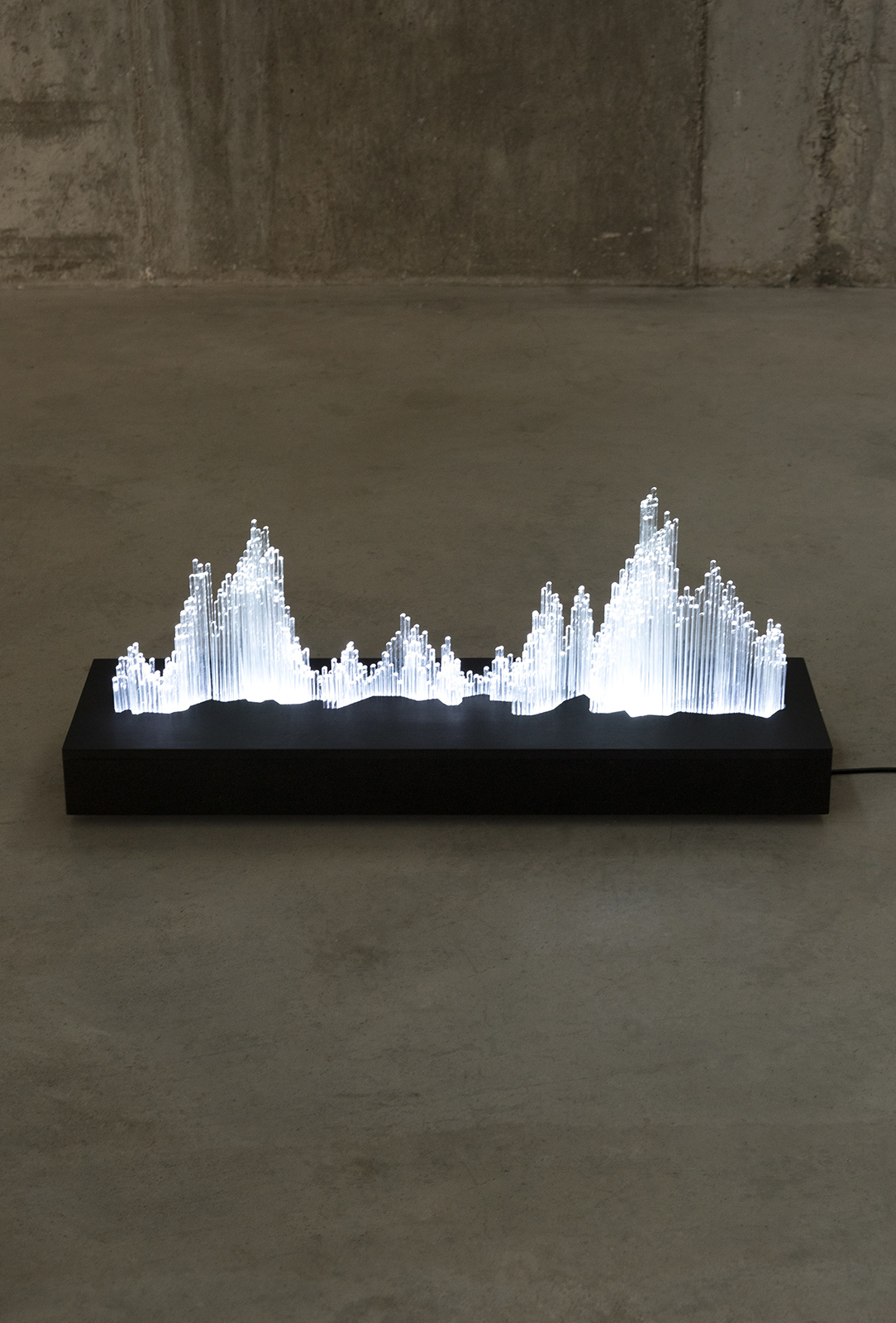
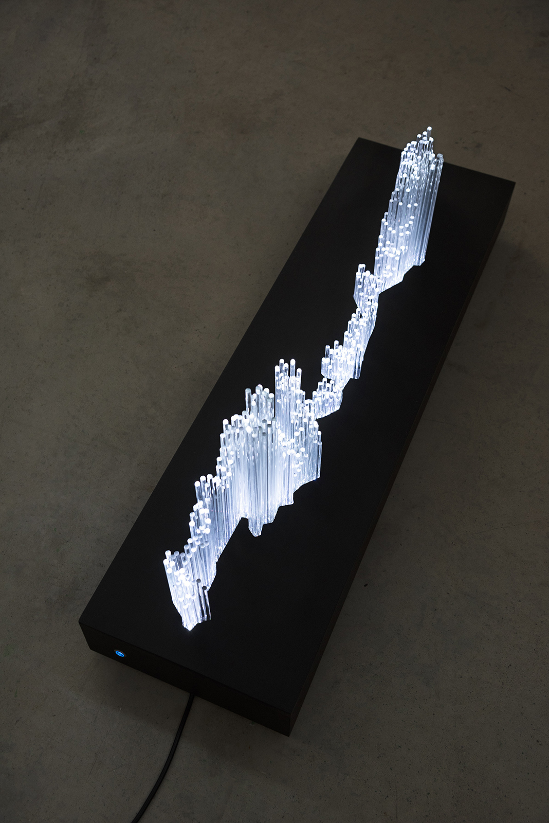
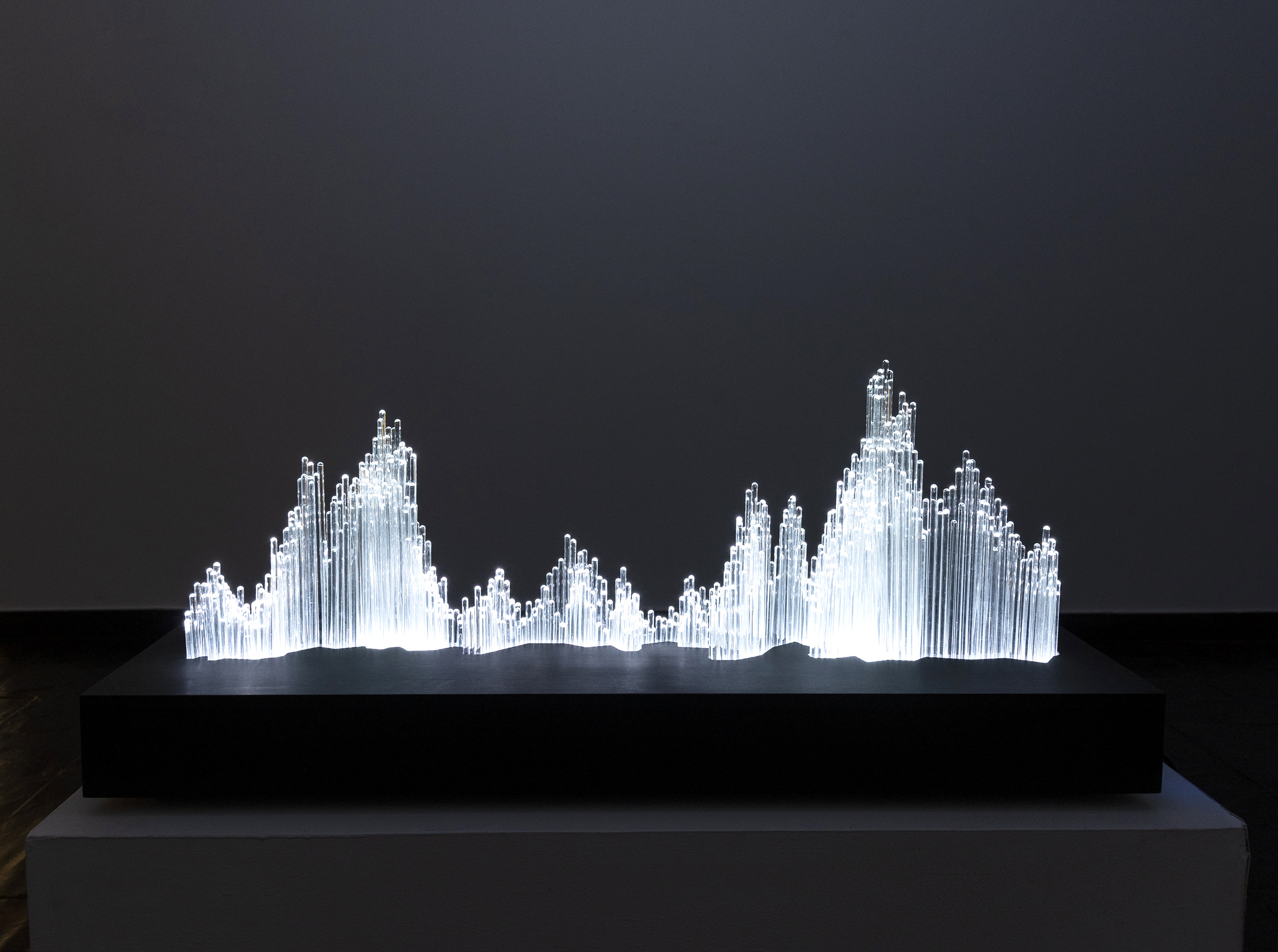
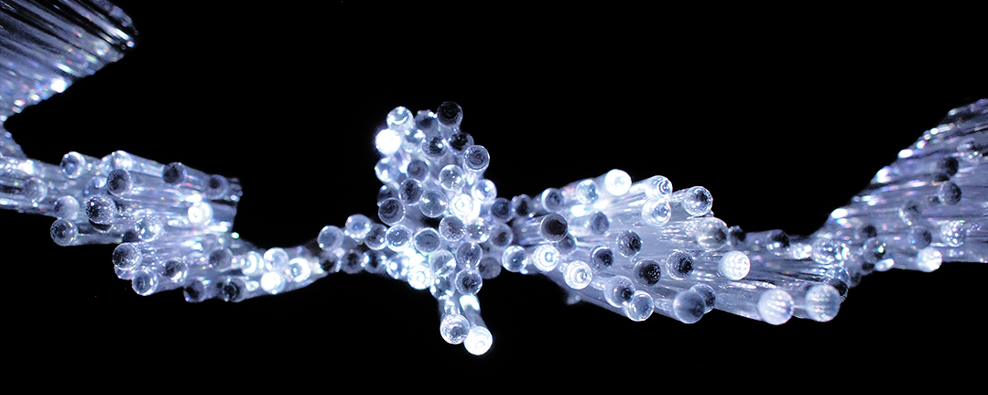
[MAFD] :: Multiple Column Chart I explores data visualisation using multiple bar charts as a starting point, a visual mechanism that allows us to represent sets of data grouped into categories and on the same axis. A luminous three-dimensional historiogram, made of borosilicate glass rod, describes in its plan an abstraction of the geographical strip of Central Africa most affected by forest fires. In contrast, its elevation informs us about the patterns of CO2 emissions, number of fires and area burnt, as diagrammatic narrative components. A transparent and dynamic landscape, where the light fluctuates in its intensity with a progressive sequencing from dim light to maximum intensity, thanks to an internal programming of arduino technology. A fragmented cartography, decontextualised from its spatial framework, which starts from a specific narrative to propose to the spectator an abstract reading, patterns of light and a skyline of data, of an environmental problem that affects us globally.
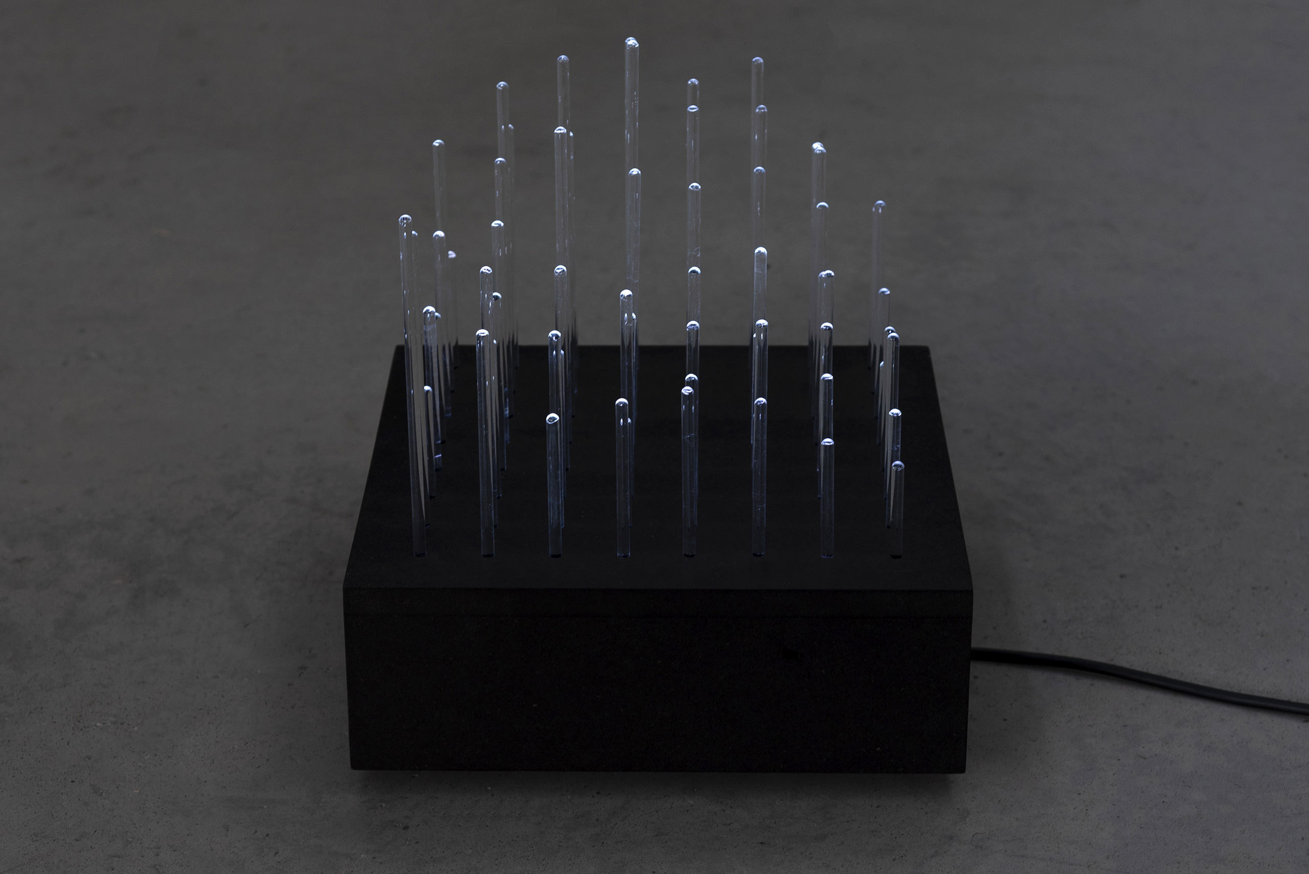
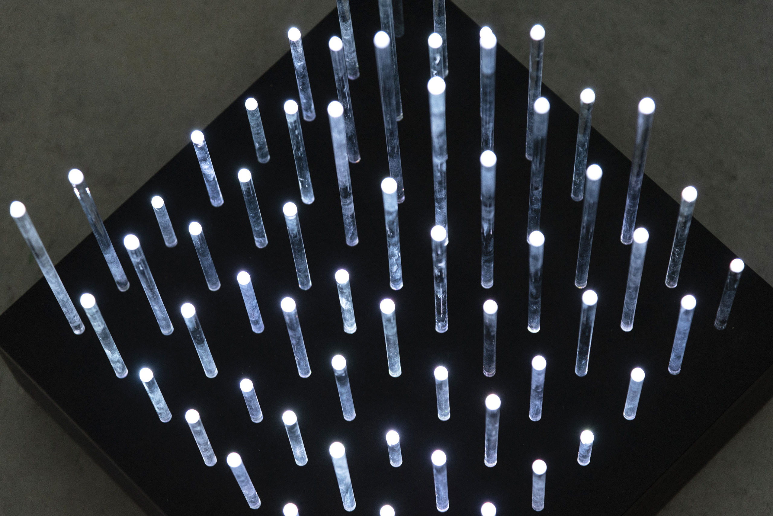
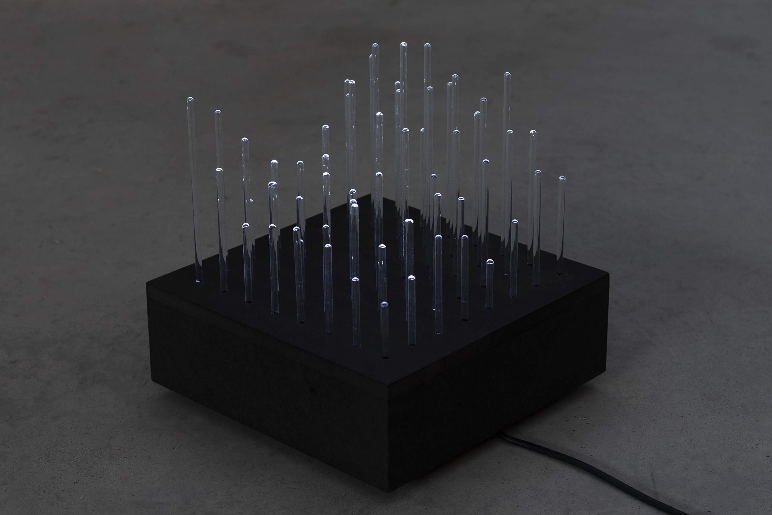

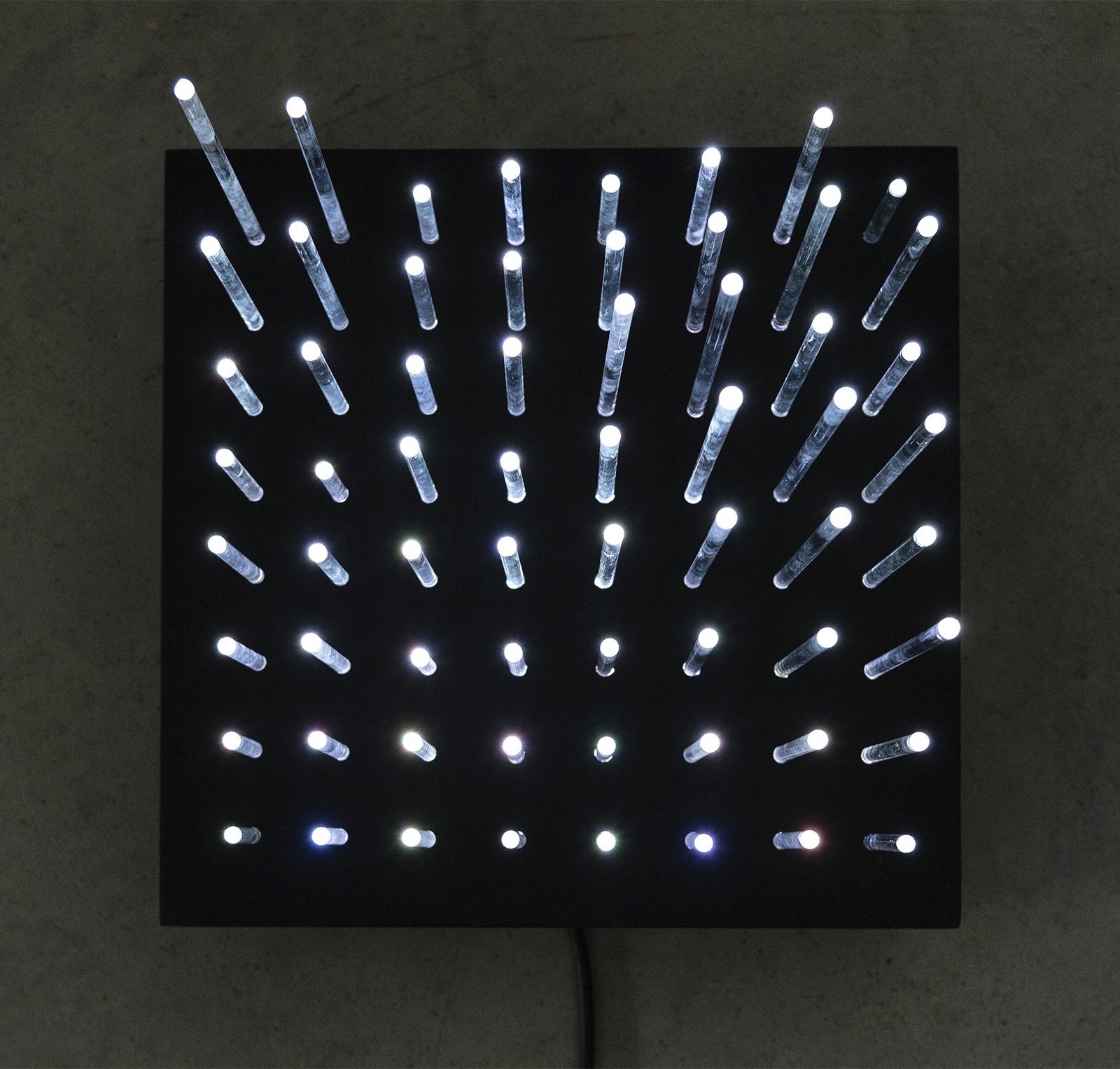
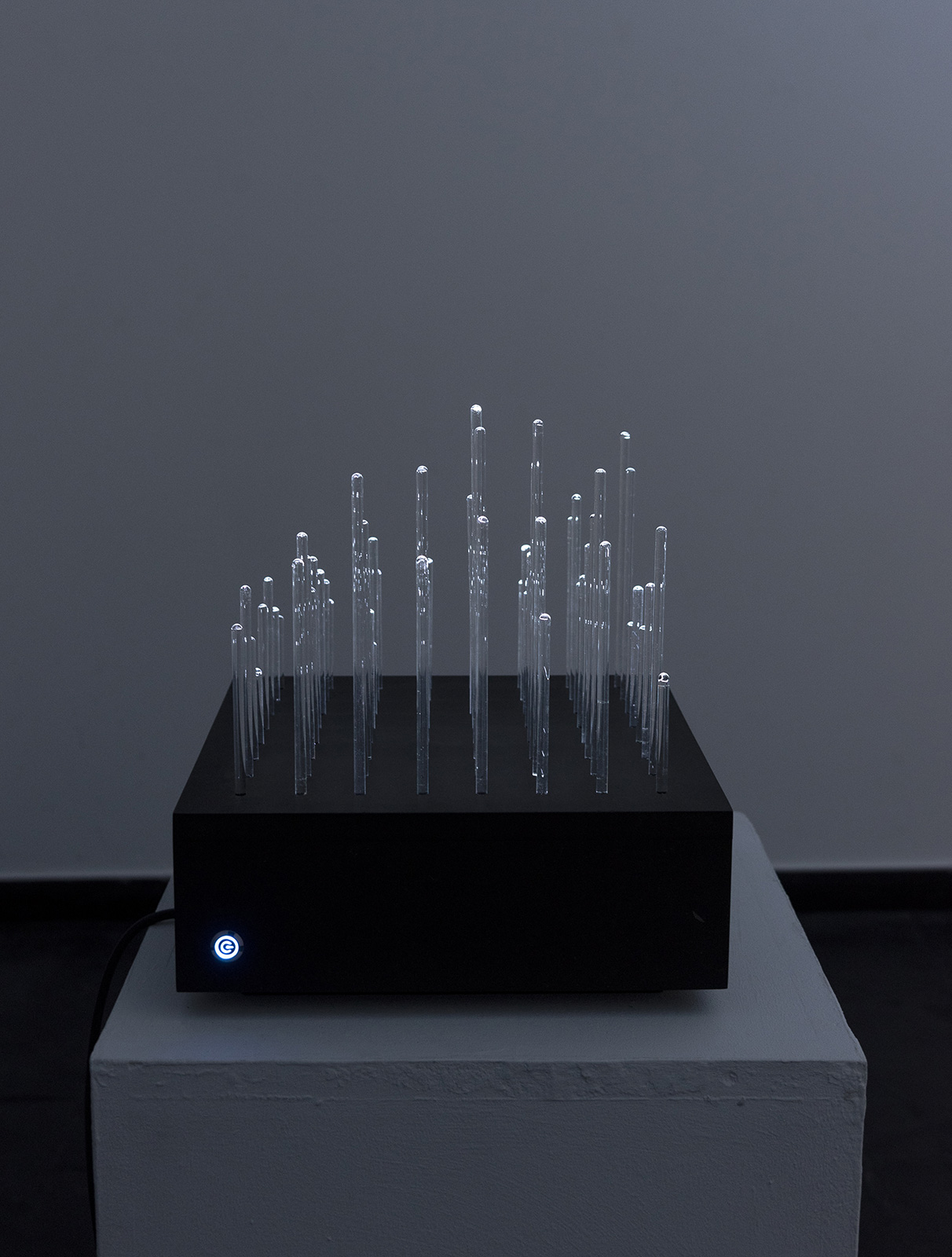
[MAFD] :: Bar Chart I explores data visualisation by taking as a starting point bar charts, used to show numerical comparisons of data between different categories. One axis of the graph shows the specific categories being compared, while the other axis represents a scale of discrete values. When we try to extrapolate this taxonomy of visualisation of information presented in a three-dimensional framework, the result is an abstraction of the visualisation through a dynamic visual mapping. The work intends, through the programmed intermittent light cycle, to make the viewer generate impossibly complex bar graphs by continuously changing the vertex of the illuminated glass rod. The represented bar graphs take their data from the research on forest fires carried out in the framework of [MAFD] :: Mapping Active Fire Data.
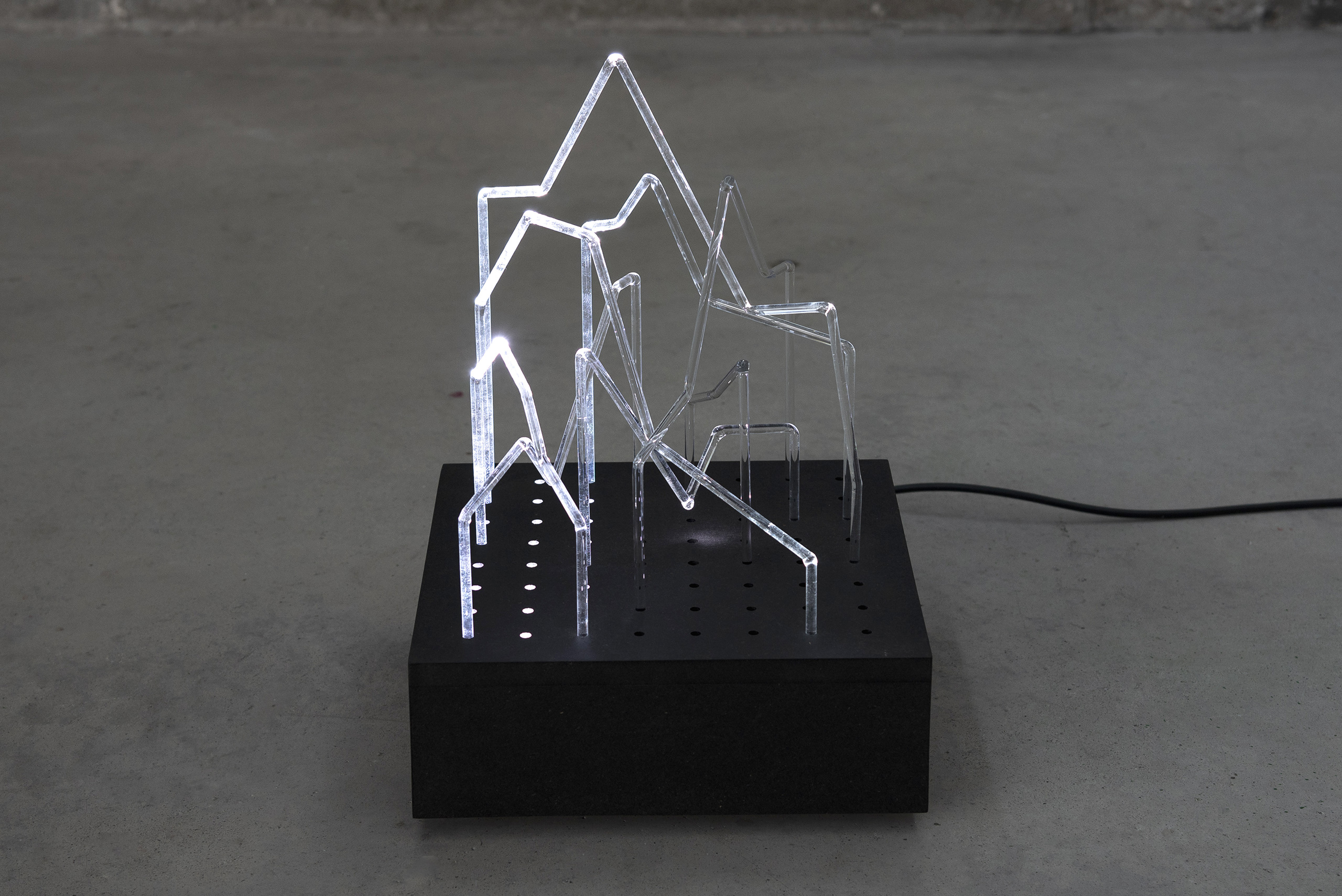
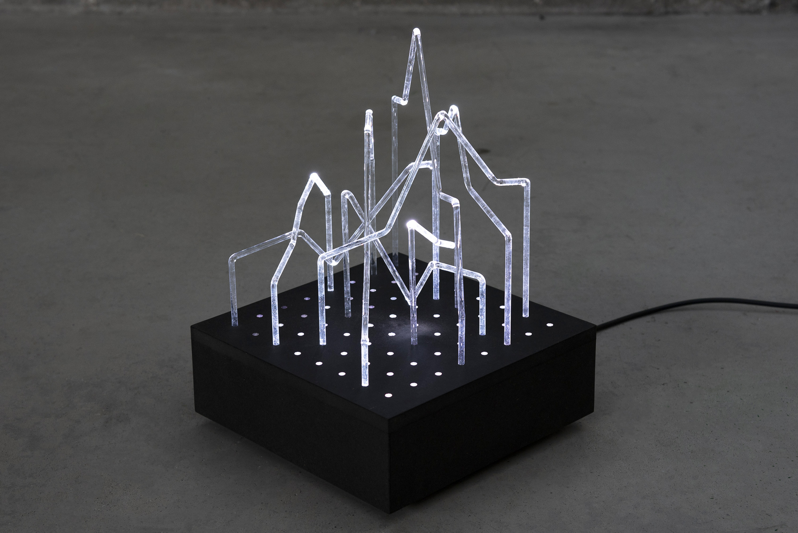
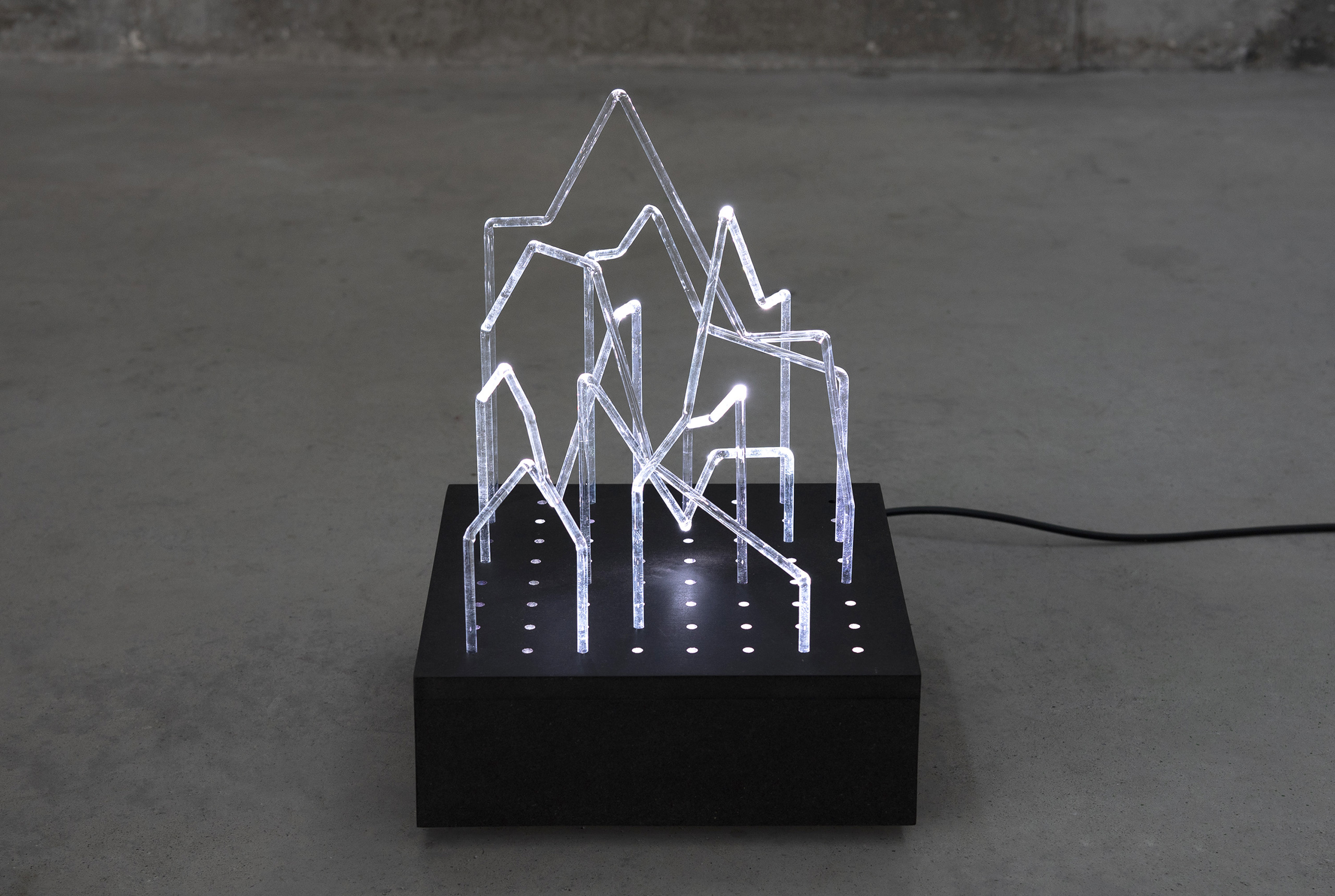
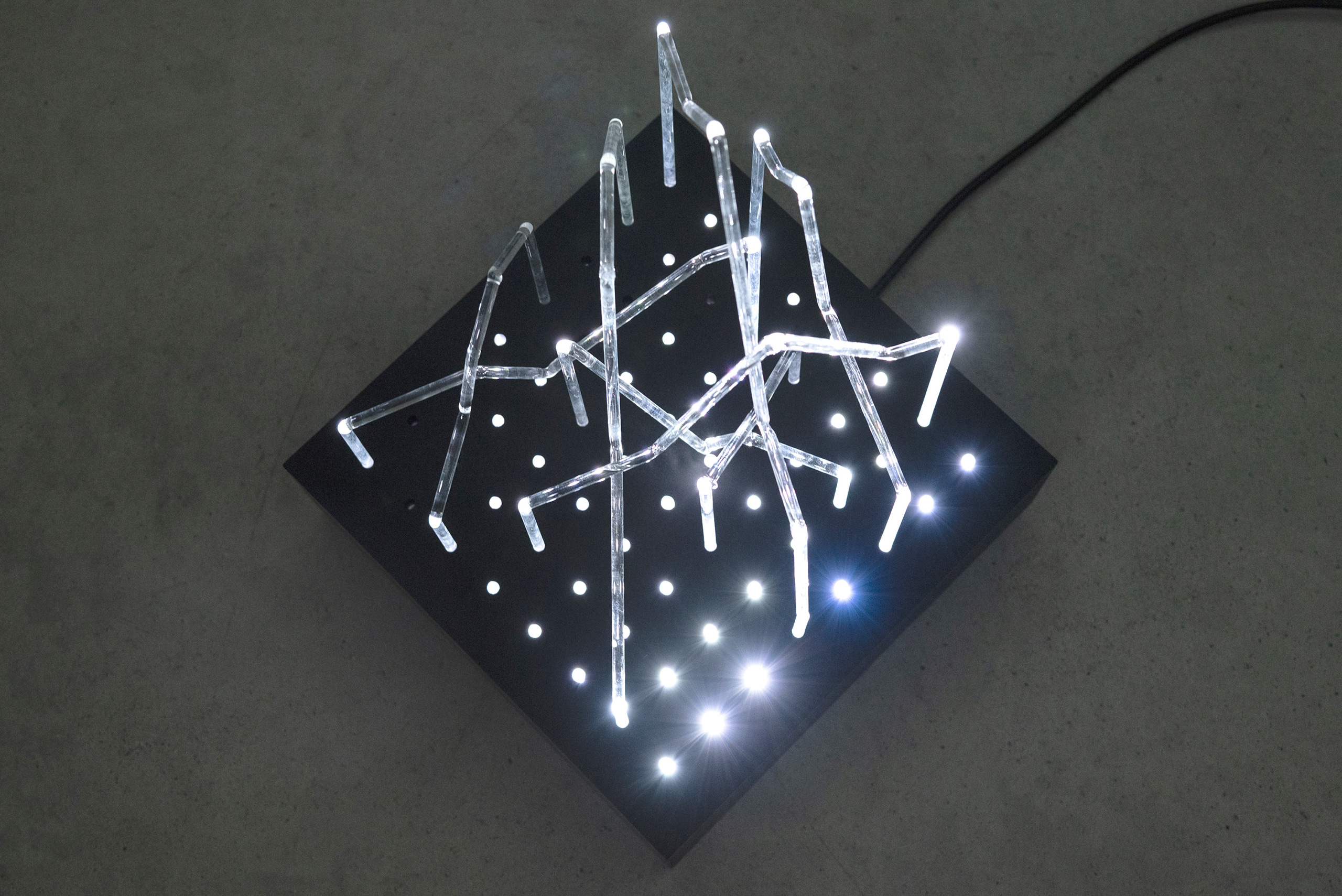
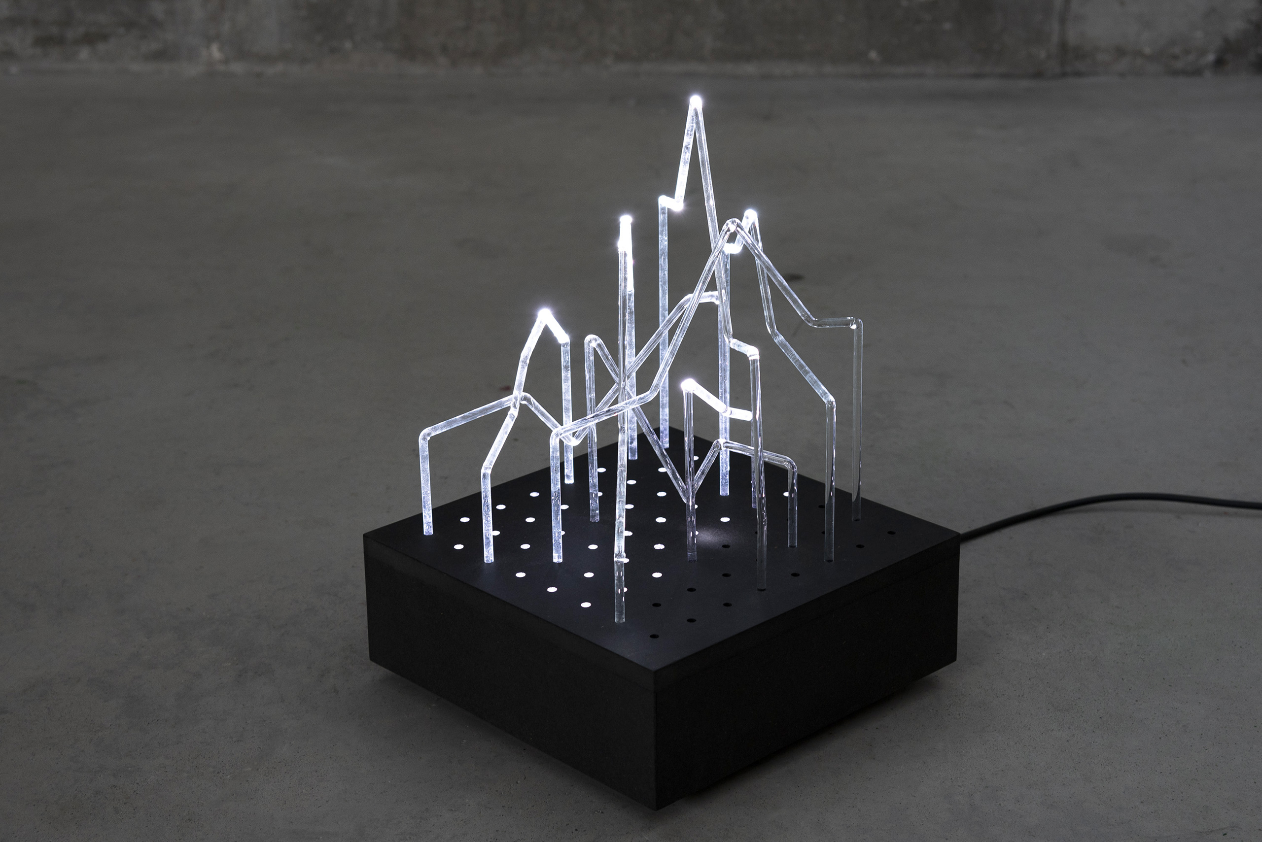
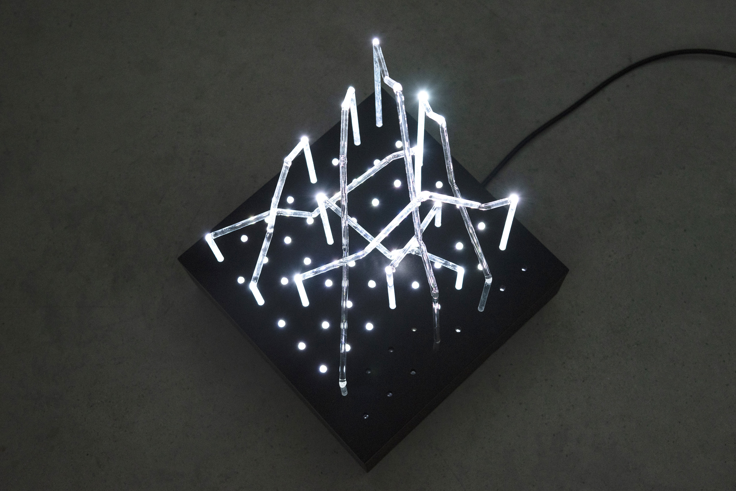
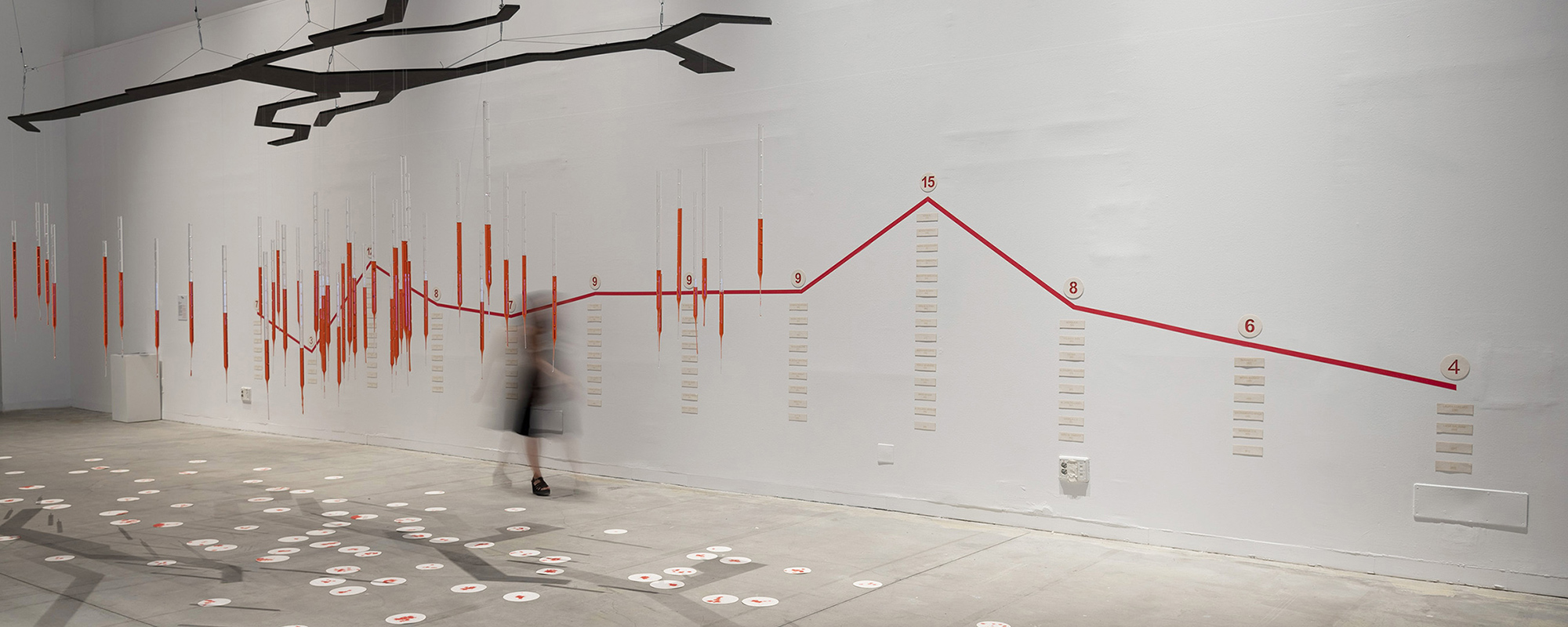
[MAFD] :: Line Chart I explores data visualisation by taking line charts as a starting point, used to show quantitative value over a continuous time interval. When grouped with other lines, it attempts to show trends or relationships between the values represented. Its representation is based on a Cartesian grid, where data points are assigned and connected by means of a line. Generally, a quantitative value is attributed to the Y-axis, while the X-axis supports a sequential categorical scale. By spatially and three-dimensionally interweaving transparent glass lines from forest fire graphs, a complex node of data accumulation is generated, a circumstantial fragment of a larger space that could extend to infinity. A framework for exploring the relational behaviour of complex narratives that affect today's society.
CREDITS ::
Conceptualisation: Esther Pizarro
Production: Esther Pizarro Studio
Technology: Markus Schroll
Funding: Project carried out thanks to the support of the Subdirección General de Promoción de las Bellas Artes, Ministerio de Cultura y Deporte.
Winning project of the Antón Grant to support sculptural creation 2017
EXHIBITED AT::
Galería Ponce+Robles. “Grafiando datos”. Madrid, España. 26/01/2019 al 08/02/2019
Casal Son Tugores. “Fuego/Hueco/Sombra/Aire”. Artistas: Esther Pizarro, Lucía Loren, Sara Quintero y Olimpia Velasco. Alaró, Mallorca, España. 22/02/2020 al 31/03/2020
Instituto Cervantes Cracovia. “Fuego/Hueco/Sombra/Aire”. Artistas: Esther Pizarro, Lucía Loren, Sara Quintero y Olimpia Velasco. Cracovia, Polonia. 27/11/2020 al 15/02/2021
Spain Arts & Science LAB in Belgium. Embassy of Spain. “We are nature. A Wall against climate change: THE BUTTERFLY EFFECT”. Artistas: Esther Pizarro y Olimpia Velasco. Bruselas, Bélgica. 23/09/2020 al 15/01/2021.
ASSOCIATED CATALOGUE ::
AAVV (2020). Catálogo: Somos naturaleza. Un muro contra el cambio climático: Efecto Mariposa. Comisariado: Ana Vázquez. Edita: Consejería Cultural y Científica de la Embajada de España en el Reino de Bélgica - Brufête ASBL/ParcoursStreetArt - Instituto Cervantes de Bruselas. Textos: Beatriz Larrocha, Delphine Houba, Clara de la Torre. Idiomas: Inglés-Español. Edición digital.