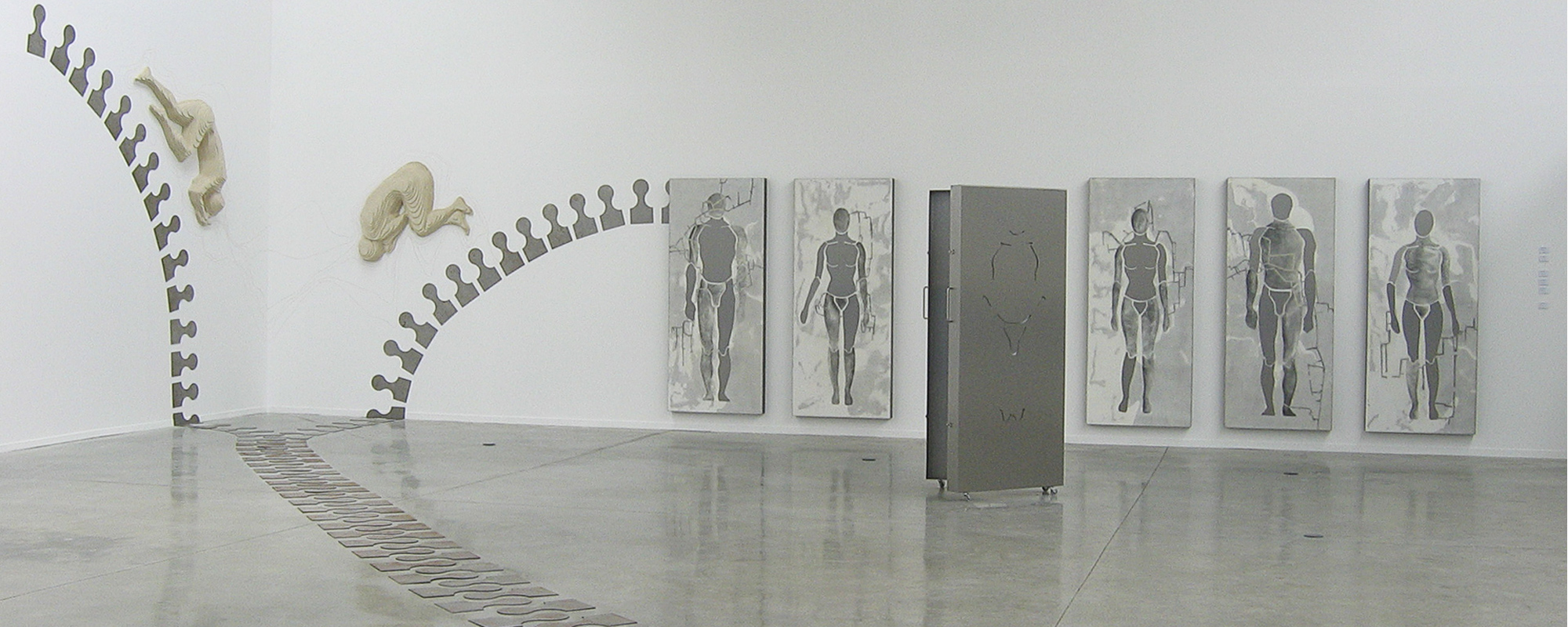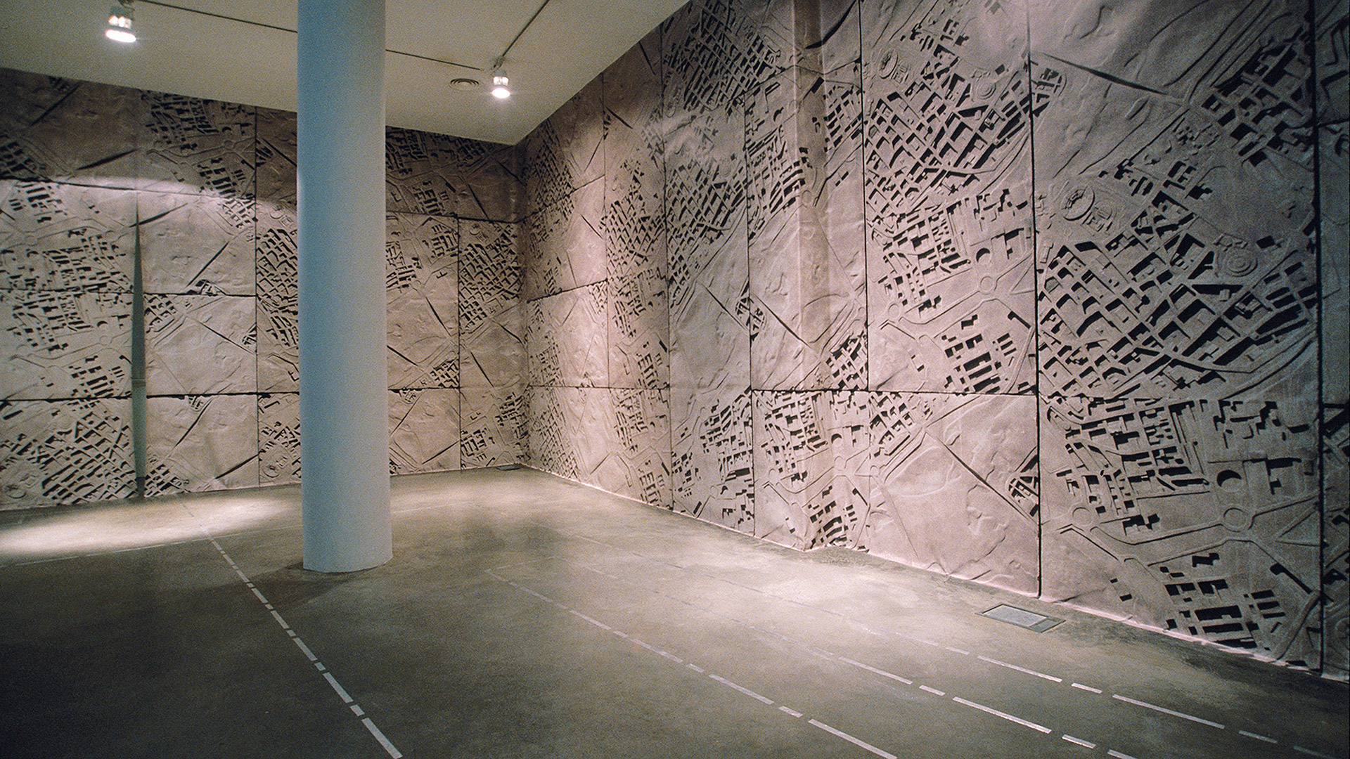
GRAPHING DATA © 2019 :: Ponce+Robles Gallery
"Graphing Data"
Ponce+Robles Gallery, Madrid, Spain
26/01/2019 to 08/02/2019

Information based on data, both numerical and statistical, is often complex and difficult to assimilate. Diagrams and graphs allow us to interpret the information to be processed much more quickly and visually, highlighting the relationship between the different elements of a set or complex system. By working visually with data, we can find patterns of behaviour that help us to establish new relationships between them, providing diagrammatic narratives that position nodes and links in the complex network of relationships in contemporary society.
Graphing Data is part of the research framework carried out for the project [MAFD] :: Mapping Active Fire Data, exhibited in Tabacalera, Sala La Fragua; and whose main objective is to show the wounds suffered by the earth's crust due to the enormous amount of active forest fires that, intentionally or accidentally, occur in it. The proposal, [MAFD], is based on a dynamic and interactive cartographic visualisation of locations and data of forest fires burning actively around the world, in the time frame of the last decade.
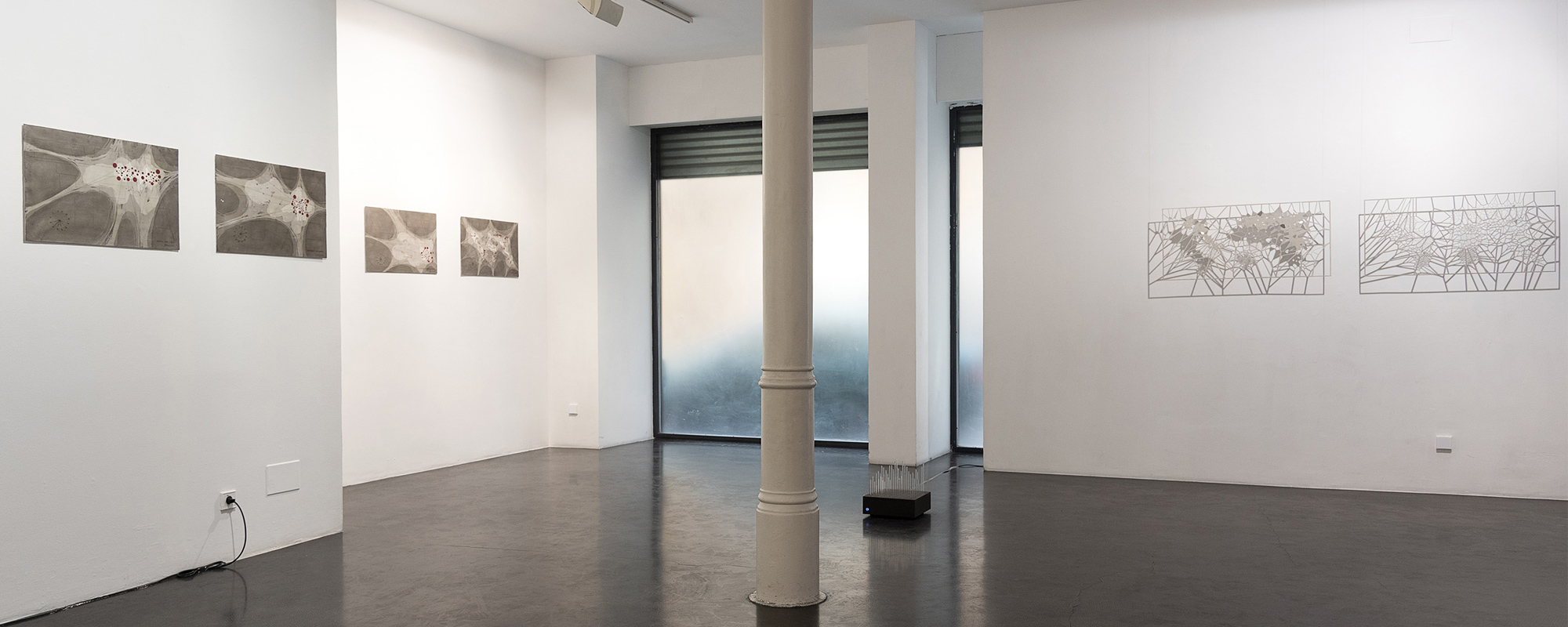
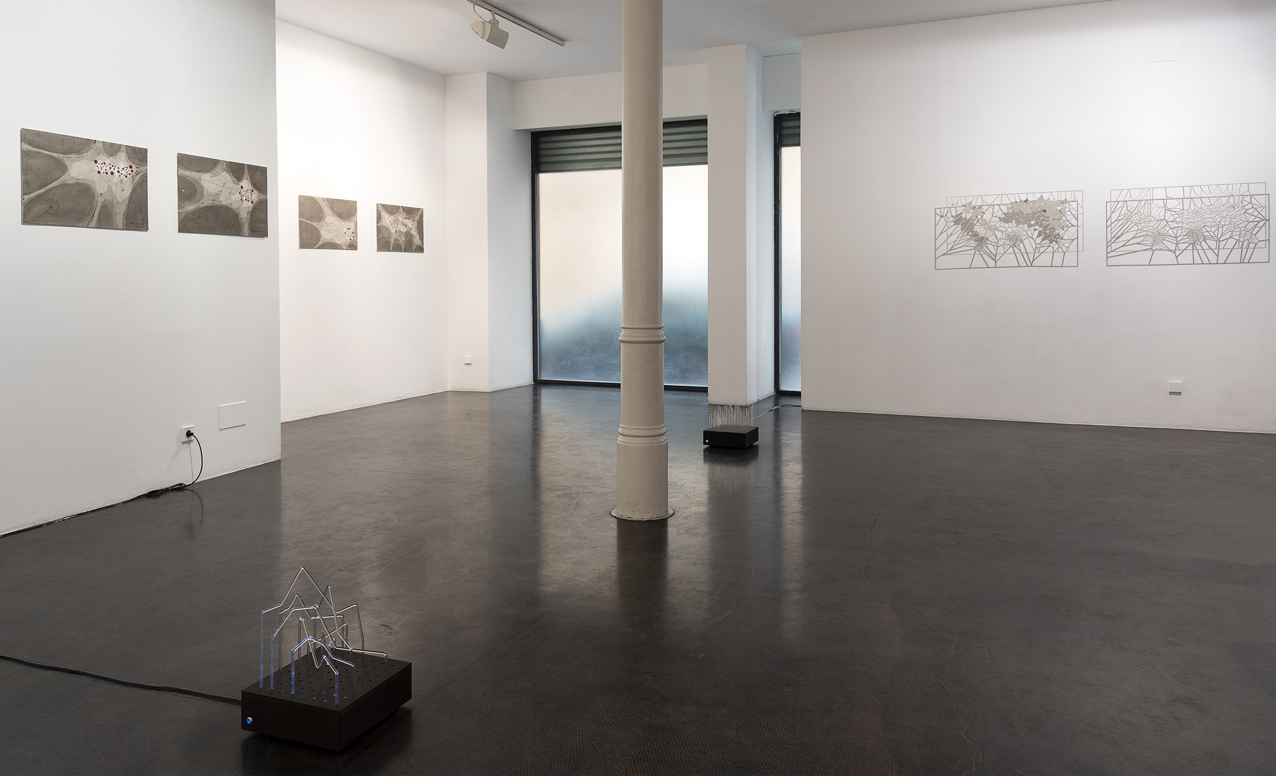
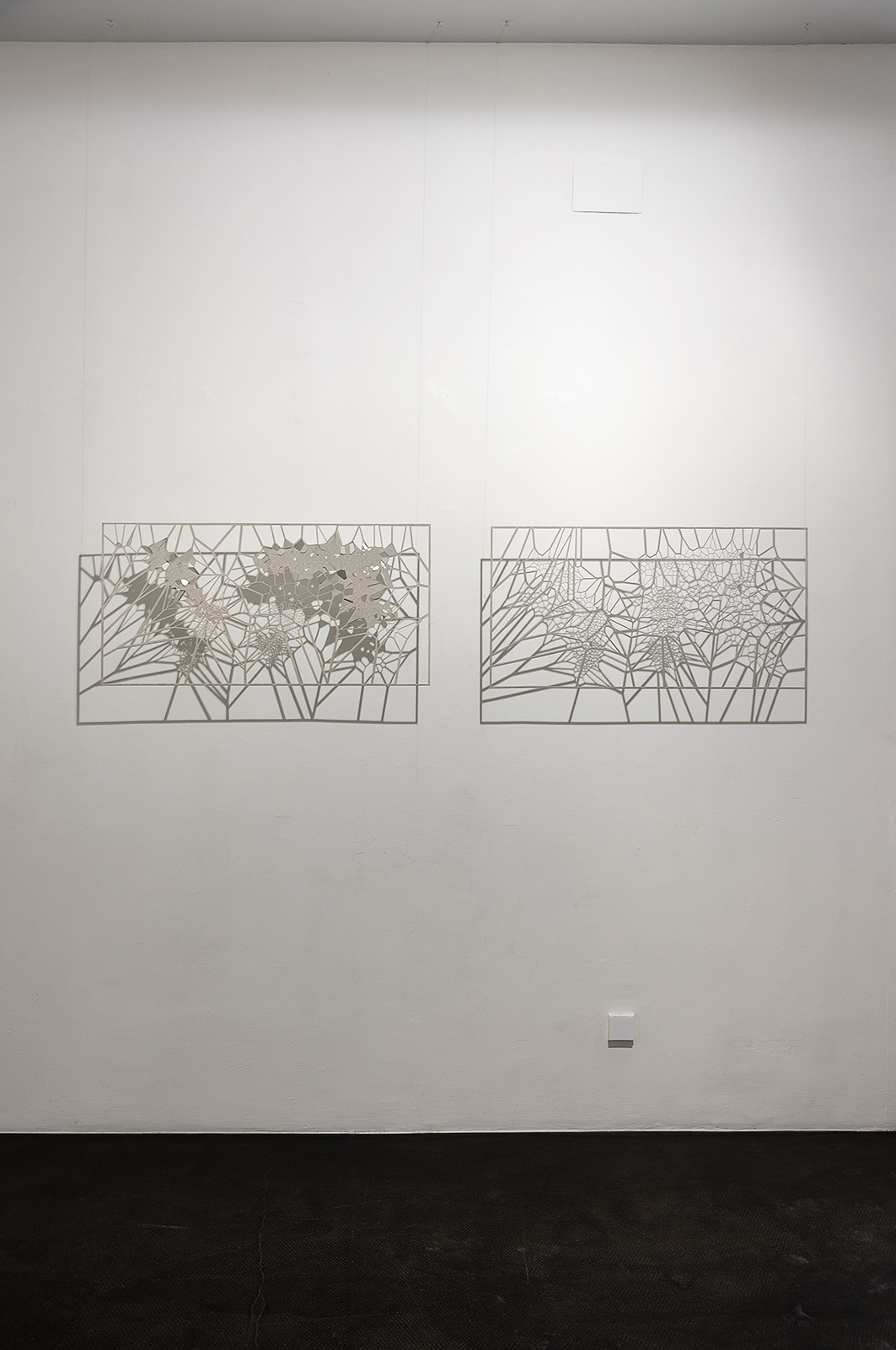
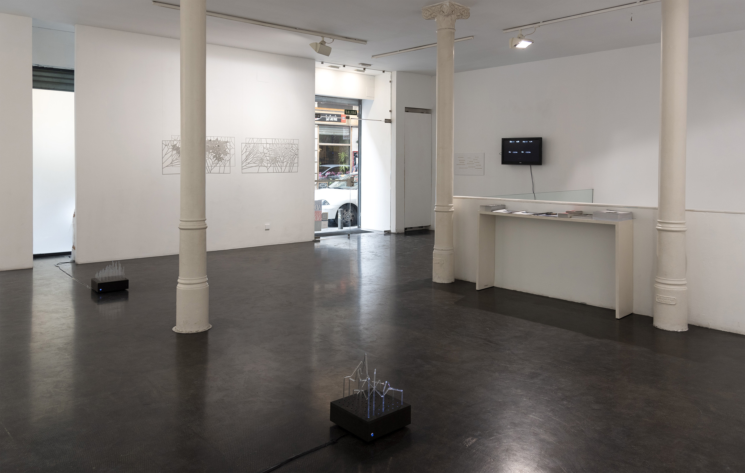
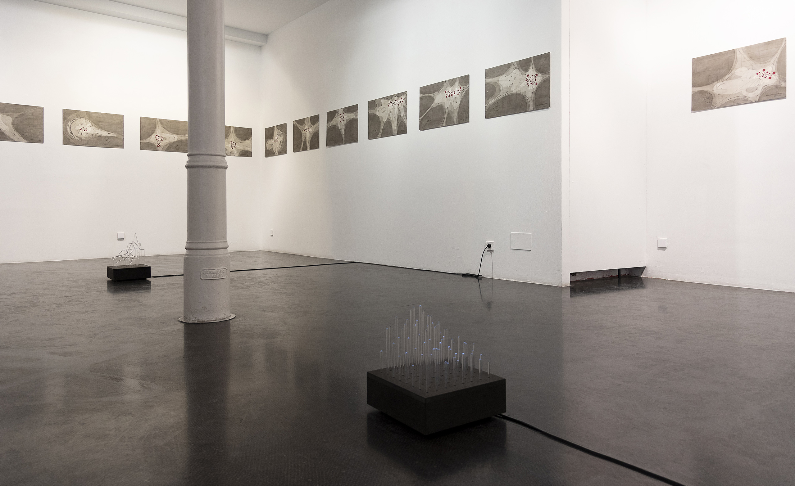
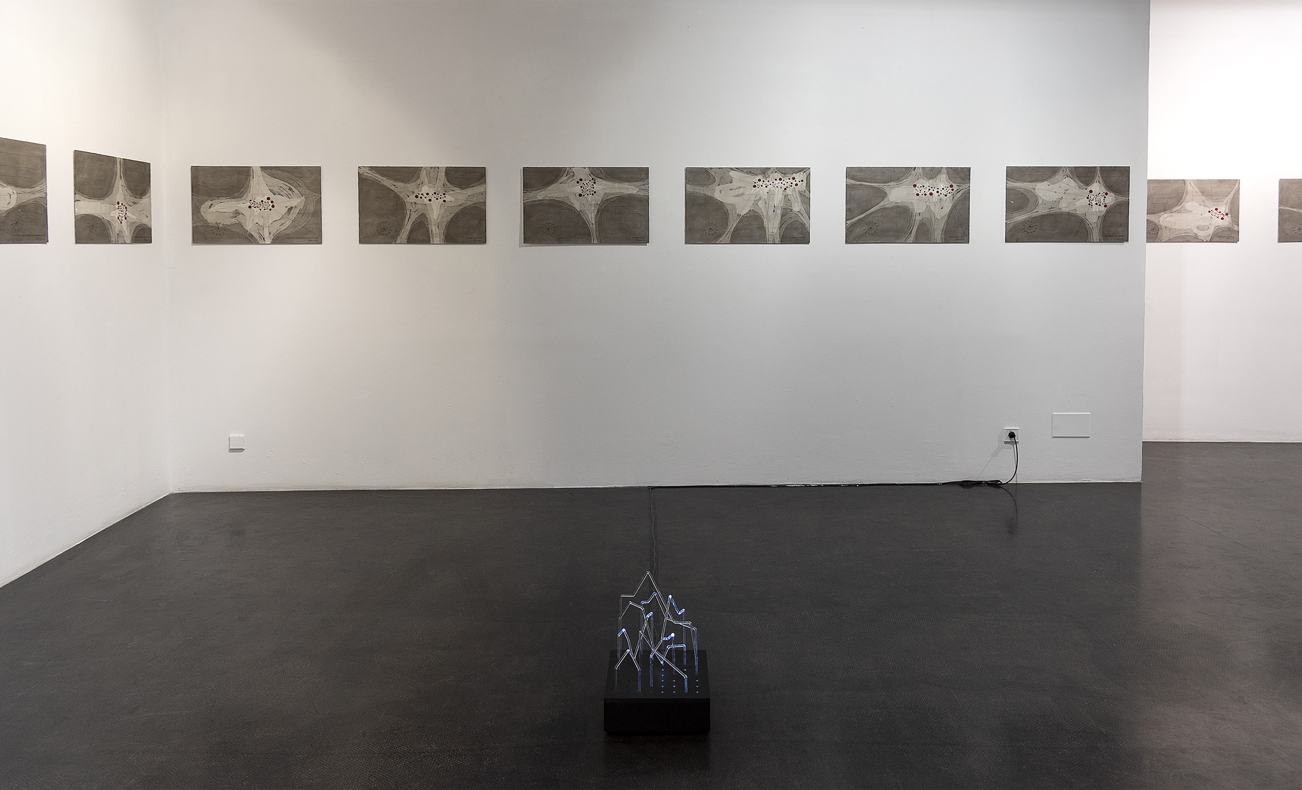
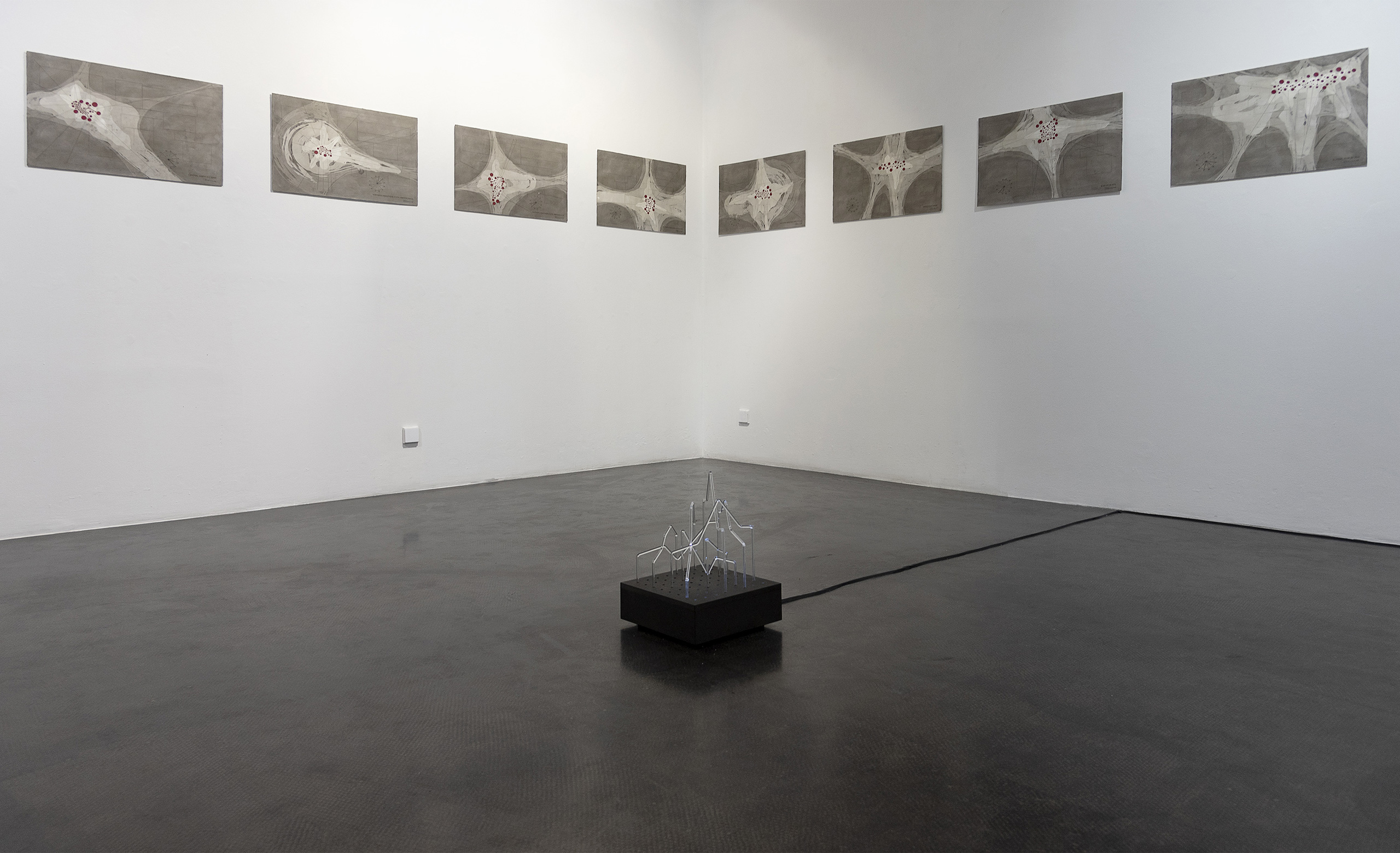
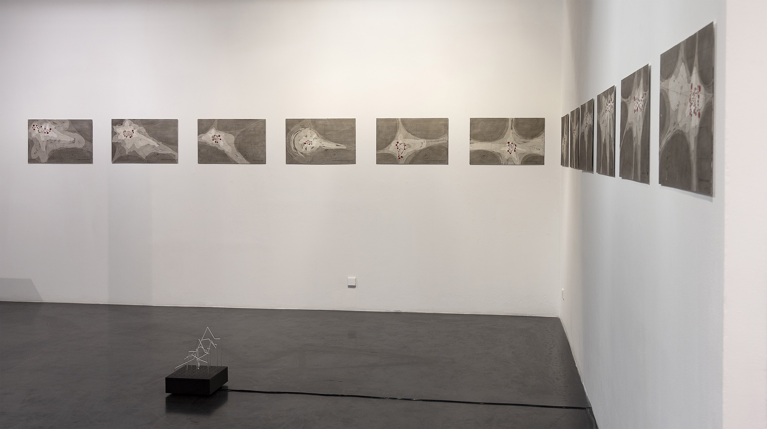
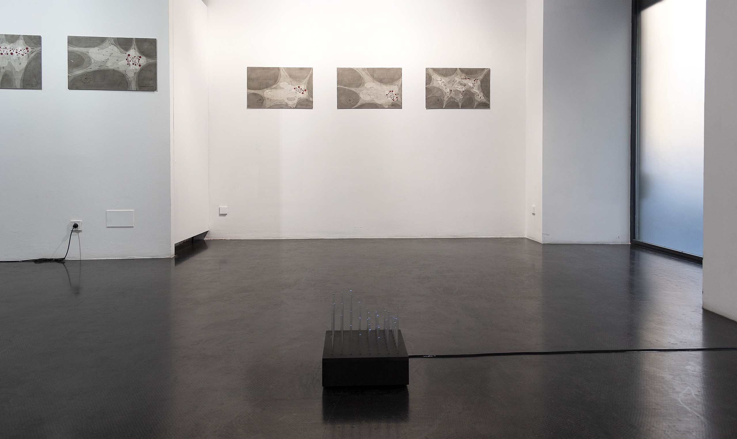
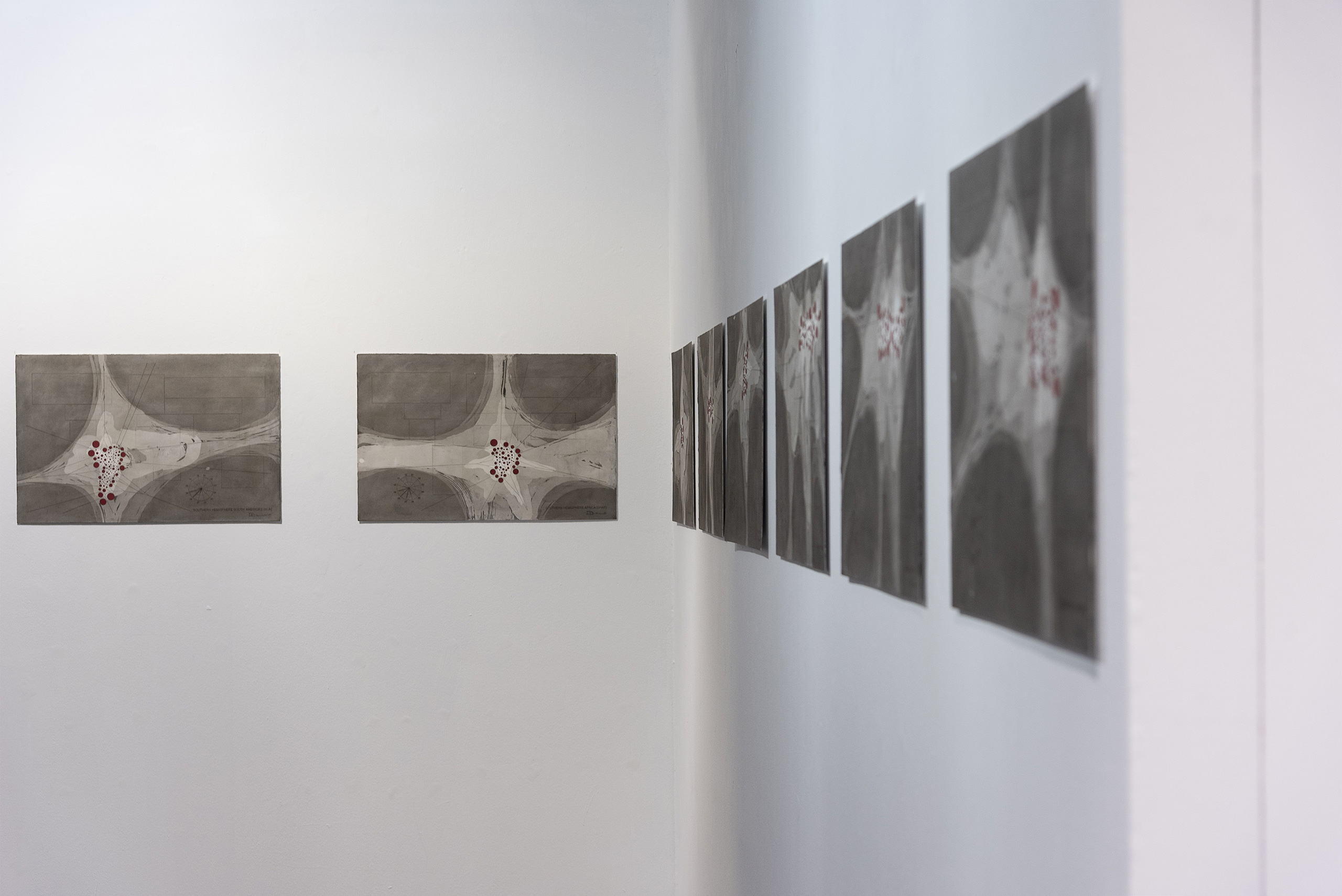
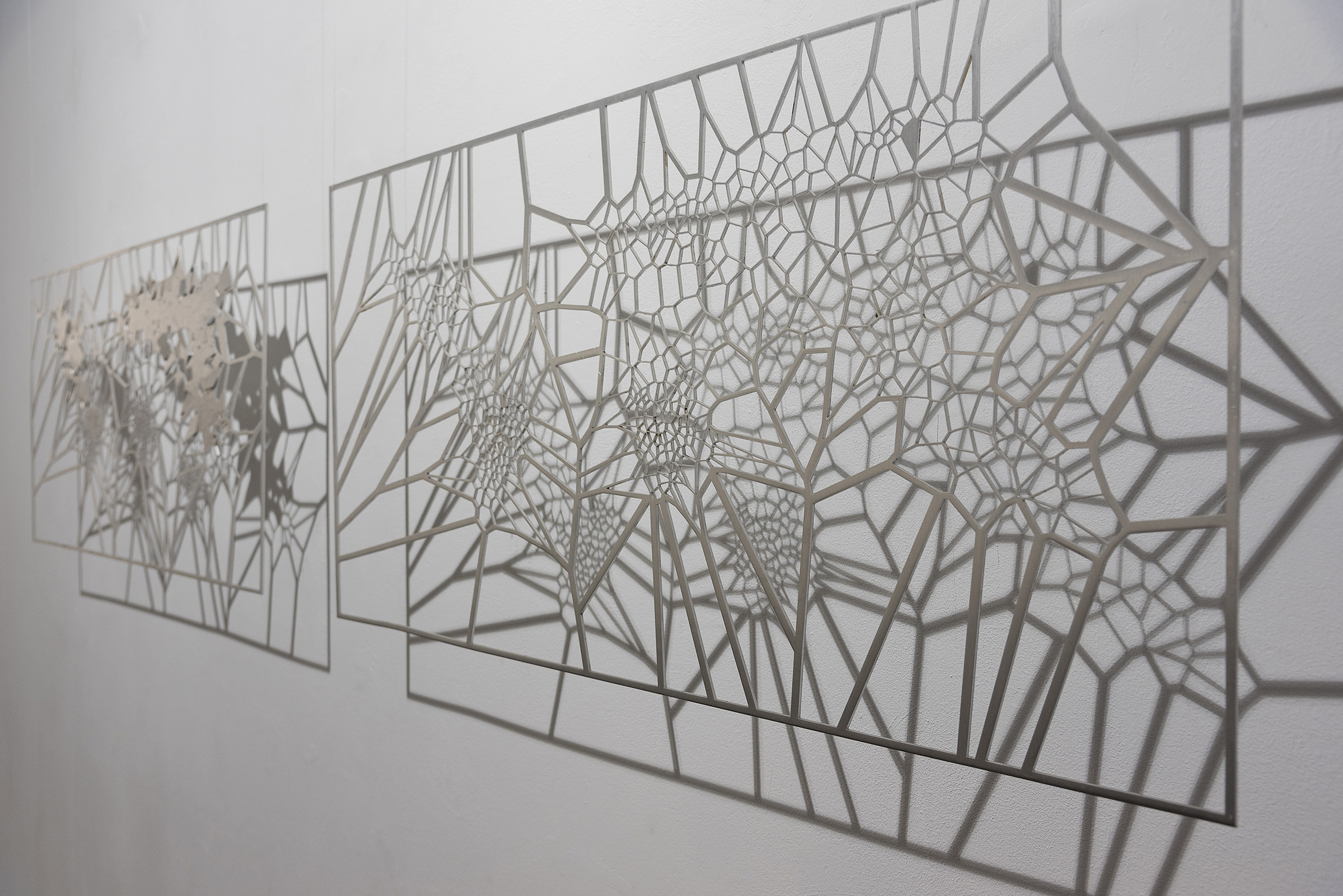
As a continuation of this line of work, Ponce+Robles presents the series [MAFD] :: Drawings, a set of fourteen drawings where each one of them refers to a geographical area of the terrestrial planisphere, according to the spatial division of the Global Fire Emissions Database (GFED). These are diagrammatic cartographies, based on the principle of the Voronoi Diagram, a type of generative computational geometry based on the concept of Euclidean metric distance. The different geometric patterns are generated from the identification in the images extracted from the Moderate Resolution Imaging Spectroradiometer (MODIS) of the centroids, the origin of fire outbreaks. The resulting geometric lattice in each mapping gives us an idea of the areas affected by large fires and the clustering or dispersion of CO2 emissions. The greater the concentration of fires and gases (centroids), the tighter the cell; and the greater the dispersion of fire outbreaks, the larger the resulting area. A mapping based on the visualisation logic of the "point density map" where each red circle represents the focus of an area devastated by fire. At a second level are the rest of the geographical areas that make up the terrestrial planisphere, identified only by a rectangle outlining their area of extension. The data contribution is reinforced with a radial graph, where an average of the number of fires per month in the geographical area in question is indicated.
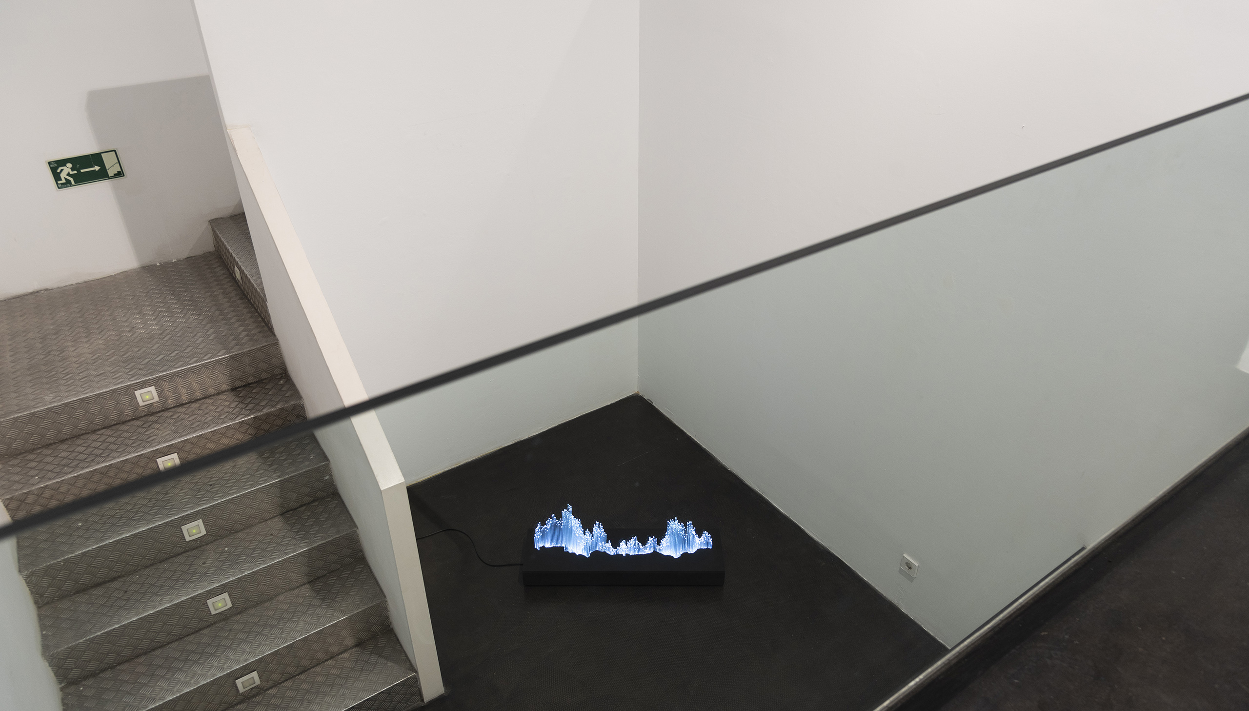
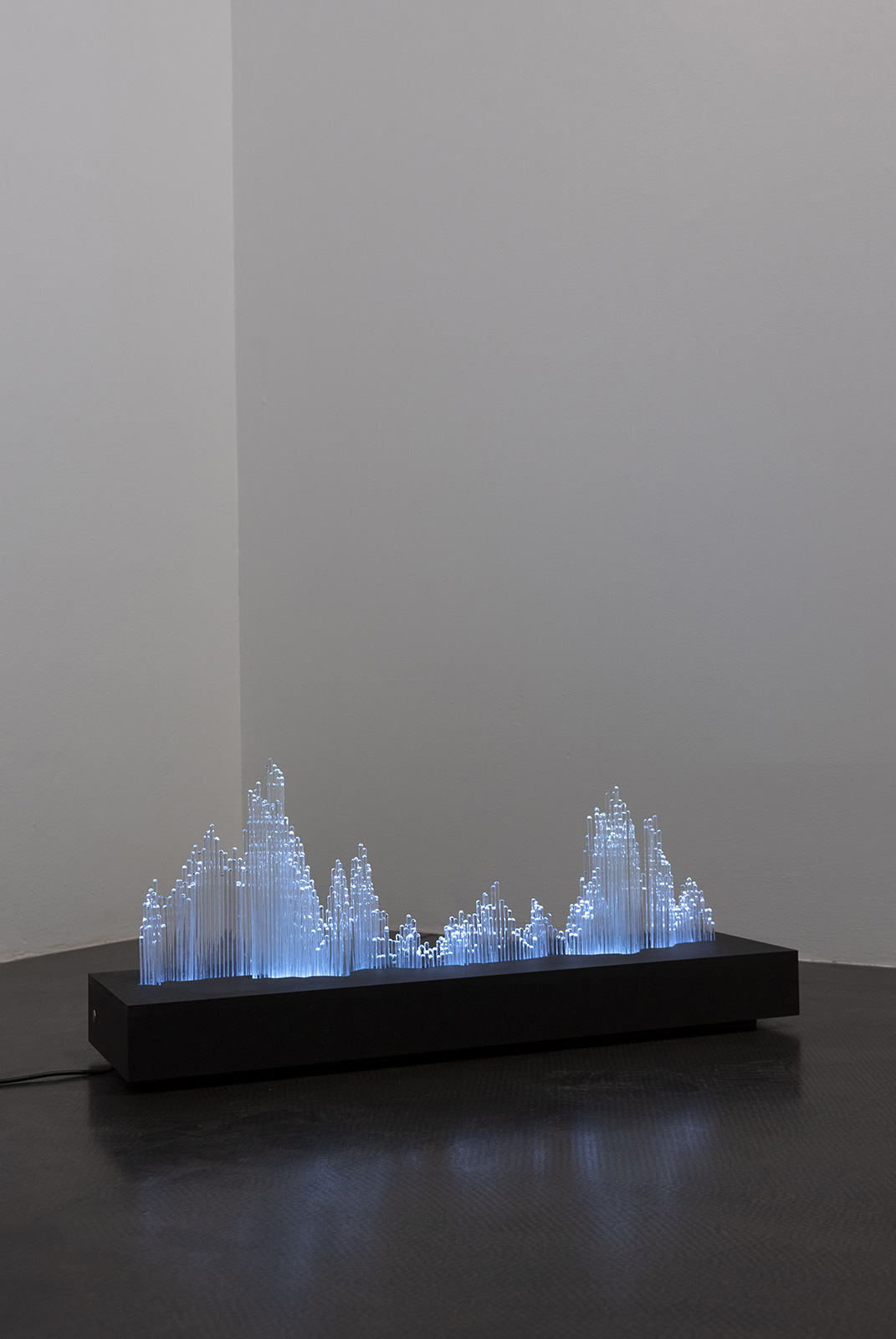
The exhibition is completed with small and medium-sized sculptures, made of borosilicate rod with light programming. Based on forest fire data, but this time decontextualized from their geographical space, they formulate dynamic gazes based on the refraction of light from abstract graphs and diagrams. A methodological exercise of the infinite possibilities offered by the visualization of data-based information.
CREDITS ::
Conceptualization: Esther Pizarro
Production: Esther Pizarro Studio
Photography: Markus Schroll
Organizers: Ponce+Robles Gallery
Exhibition mounting: Esther Pizarro Studio, Markus Schroll